

The internet spent the last decade sanding the physical world smooth. Walk into a boutique hotel in Shoreditch, a coworking space in Tokyo or a coffee shop in Brooklyn and you get the same room. The menu board uses the same sans-serif, the floors are the same pale oak, and everything has the same careful neutrality, designed so nobody could possibly object. Kyle Chayka gave it a name in 2016: AirSpace.
Step outside and the illusion falls apart. A city's visual identity was never drawn on a 120Hz screen. It was worked out over decades of bad weather, traffic, council politics and whatever the buildings needed to survive. For art directors who build brand systems on flat displays, the street is the better teacher, because out there an identity either holds up or it disappears.
How cities found their type
A clean artboard is a sealed room. The pavement adds diesel soot, rain, drivers doing 70 and decades of people pasting things over your work. The typefaces and colours that now define the world's big cities started as answers to those problems. The style came later.
Buenos Aires: built to take a beating
Buenos Aires runs on a tension between European elegance and street-level chaos. The base layer is weathered granite grey, cut through constantly by the yellow and black of the city's taxis.
Between 1971 and 1972, the city brought in the studio of Ronald Shakespear and Guillermo González Ruiz to build its first organised signage system, the Plan Visual. Helvetica became the municipality's house typeface. They cleared away a mess of mismatched street plates and put one system on the street corners. It lived through hyperinflation, a military dictatorship and decades of patchy maintenance. Shakespear's studio went on to sign the city's hospitals in 1978 and the Subte in 1995. The city kept coming back because the first system worked like infrastructure.
The other half of the city's lettering started with a rule. Until the early 20th century, Buenos Aires required delivery carts to be painted grey. The story goes that three Italian immigrants at a cart workshop started painting fine red lines along the bevels, customers liked it, and competitors copied them. The lines grew into fileteado porteño: heavy ornament, bold colour and gothic lettering. In 1975, the city banned it from buses. Forty years later, UNESCO put it on its list of the world's intangible cultural heritage. Shakespear's municipal order and the fileteadores' ornament have shared the city ever since. Buenos Aires needs both the discipline and the rebellion.
London: type as traffic law
London baseline: Routemaster Red (#CE2029) / Underground Blue (#0019A8) / Slate (#4F5D65)
In London, graphic design works almost like legislation. The canvas is damp brick, wet slate and deep navy, broken up by transport red and the yellow lines painted on the asphalt.
When Britain's first motorways opened in the late 1950s, the signs weren't up to it. Road signs at the time used the Llewellyn-Smith alphabet, which was capitals only. In 1957 the Ministry of Transport hired Jock Kinneir and his assistant Margaret Calvert to design the new motorway signs, and the work later expanded to every road in the country. Their biggest decision was mixing upper and lower case. As Calvert explains it, capitals make you read letter by letter, while mixed case lets you read the shape of the whole word. The change met some resistance. At 70 mph, the shape of a word is all a driver gets. Add the lettering Edward Johnston drew for the Underground in 1916, along with the bar-and-circle roundel, and you have a city whose authority is partly typographic.
Madrid: the street sign that became a typeface
Suelo madrileño: Baked Terracotta (#C05A46) / Granite Stone (#A6A6A6) / Castilian Blue (#0055A5)
Madrid is a tactile city. The palette is warm, with Castilian sun bouncing off old clay brick and Sierra granite under a very blue sky.
The city's commercial vernacular is tile. Painted azulejos covering shop and tavern fronts are part of what makes Madrid look like Madrid, and the craft peaked between the late 19th century and the first decades of the 20th. The densest cluster is around Plaza Mayor and Plaza de Santa Ana, where tourists still pose in front of the tiled facade of Villa Rosa.

Found the inspiration for her Ferpal Sans font in Madrid’s ceramic signs.
Then the city did something most councils wouldn't. From 1991, Madrid commissioned the ceramicist Alfredo Ruiz de Luna to design the street plaques for 385 streets in the historic centre, each one made from nine tiles. By then tile had stopped being practical, and Madrid chose it anyway. The lettering on those plaques outlived the commission. In 2019, Joan Carles Casasín and Pablo Gámez turned it into Chulapa, a free typeface based on an idea by Silvia Fernández Palomar. It is a non-geometric sans-serif that keeps some of the irregularity of hand lettering. In November 2025, Chulapa became the official typeface of the Ayuntamiento de Madrid's new identity, replacing Martel Sans. A street sign became the city's brand.
Sydney: legible in full sun
Pacific exposure: Ferry Green (#1B4D3E) / Sand Gold (#E6C280) / Deep Ocean (#004B6E)
Sydney's identity is designed for a lot of light. The palette comes from whatever's in front of you: the green and gold of the harbour ferries, pale sand and the glare off the Pacific.
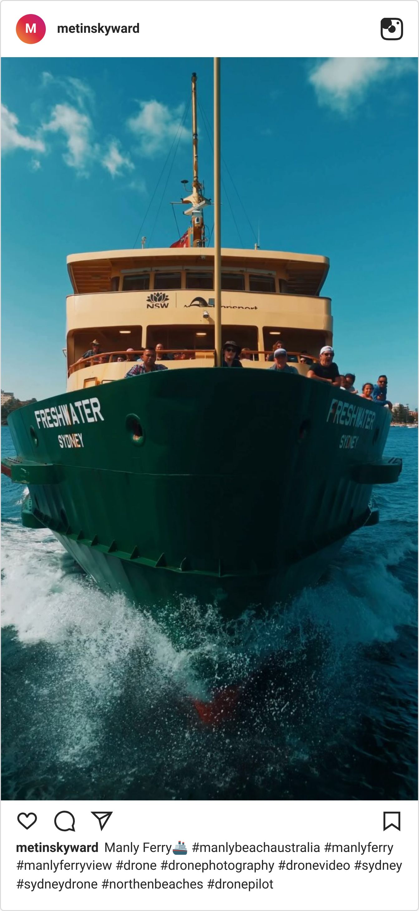
Sydney's public signage is clean, geometric and unapologetically practical, with heavy grotesque type that stays readable in harsh sun on an exposed headland. The same functional look runs through the city's outdoor culture, from the markers along the coastal walks to the branding of the run clubs and surf labels that line the beaches.
Friction is the brief
Distinctiveness comes from dealing with friction. Global platforms push brand identities that could live anywhere, and an identity that could live anywhere tends to get ignored everywhere.
None of these cities got their look from a design-system template. Buenos Aires had to fix a street-sign mess. London had to make signs readable at motorway speed. Madrid kept a craft alive long enough for it to become a brand. Each system was built around a hard, local limit, and the limit is what made it last. The designers who stay hard to replace treat typography as part of the structure of a place.
How to apply it this week
Don't start your next identity exploration with a Google Fonts shortlist. Pick one city's wayfinding constraints and work inside them.
Set yourself Calvert's test: can someone read the word's shape in the second they have? Or limit your palette to Madrid's terracotta and granite. Then rough up the digital comps. Run them through a low-res print, blur them, or push the exposure as if they're sitting in midday sun. If the identity breaks under a bit of simulated street grit, it was too fragile for the real world anyway.
