

Chessie Domrongchai used to be a beauty influencer. She built an audience the ordinary way, showing people which blushes and body lotions to buy, then arranging the results around her home with the packaging out and the labels facing the camera. Now she posts videos of herself taking the labels off. Soaking them, or working at the adhesive with a hairdryer until the bottle underneath is just a bottle. One before-and-after has done 2.9 million views.
Nora Soliman does the same under @figfeelings. Allure calls it visual decluttering, or unbranding, and the reasons people give are consistent. Domrongchai describes it as shifting attention from what a product looks like to what it does. Several say they buy less afterwards, and that once the front of the bottle stopped talking they started reading the ingredient list instead.
Somebody paid full price for an object, took it home, and then removed the part a studio was hired to make.
@figfeelings Why I remove visual clutter in my house. #labelcensorship #declutter #visualclutter #organization
Four trends, one behaviour
The label-peeling is one corner of something bigger, and it helps to see the corners together.
Underconsumption core started on TikTok in the summer of 2024 as a rejection of haul culture. Creators film nearly empty skincare bottles, trainers they've worn for six years, the same three jumpers on rotation. The point is that ordinary, used things are fine. #projectpan, a sub-genre, is people finishing a makeup product down to the metal before buying another one. By June 2025, videos associated with the trend had reportedly passed two billion TikTok views, and it came back hard this March, helped along by a UN textile-waste report and a wave of hundred-day no-buy challenges. When Visibrain measured it, an average underconsumption post was pulling around 633 likes, nearly three times the average post tagged #TikTokMadeMeBuyIt.
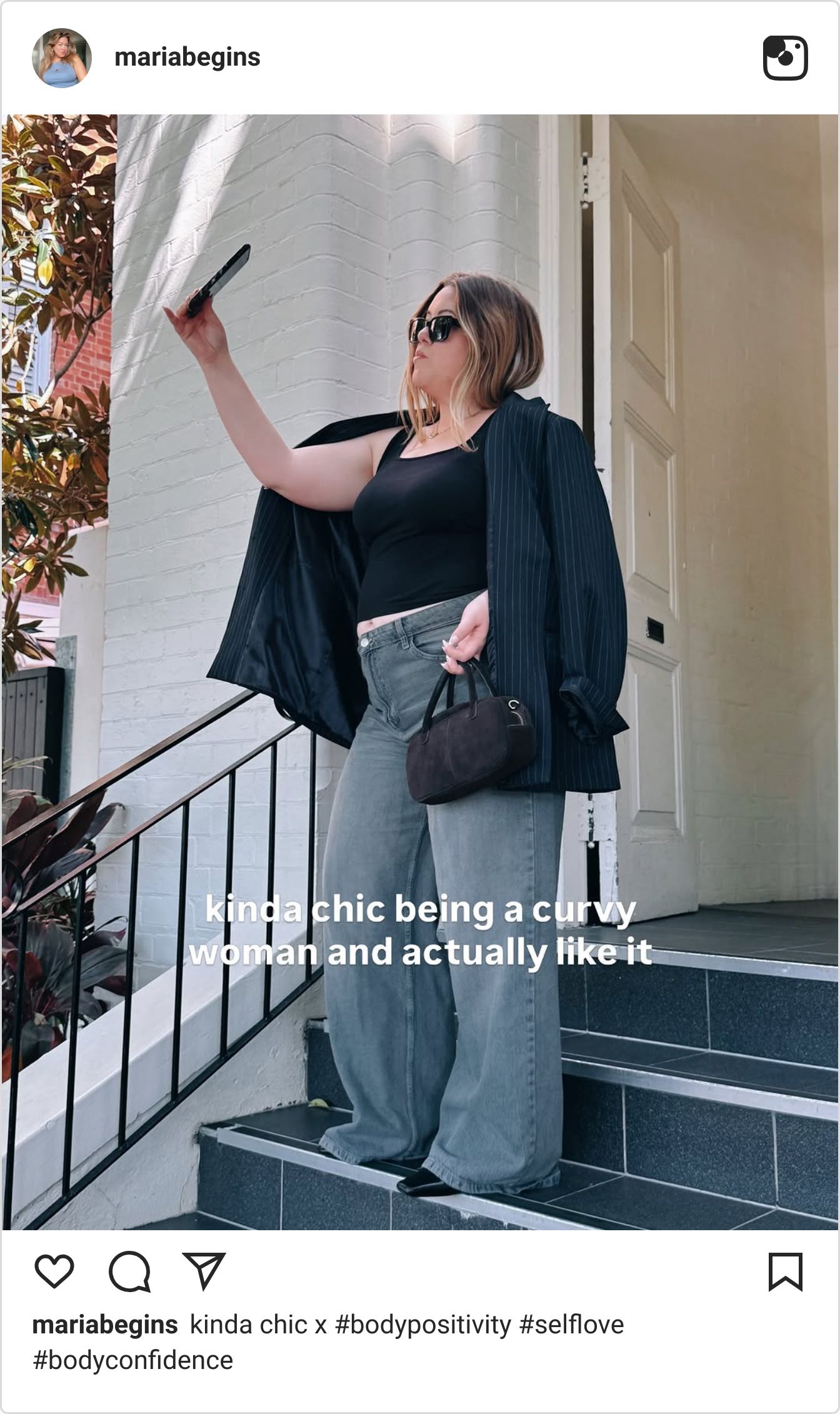
Kinda chic arrived in April. Maria Castellanos, a plus-size creator posting as MariaBegins, put a line of pale yellow text over a photo, and by midsummer the format was the format. Eating pizza. Being overdressed. Doing something alone and scared. Getting older. The things being declared chic were hers to declare.
Then TikTok itself put a name on the whole thing. Its 2026 trend report calls the mood Reali-Tea, and the hashtags it points to are telling — #joblife, #hygiene, #lockedin — routine, accountability, the shape of an ordinary Tuesday. Not a single aspirational category among them.
Peel the label, finish the product, call the boring thing chic, film the shift. Four trends, one behaviour. The ordinary has become the flex.
Aspiration turned inside out
For fifteen years, social media ran on showing what you had. The villa, the haul, the unboxing, the jet. A brand's job was to be the thing in the picture, and creative briefs were written accordingly: make our product the desirable object in somebody's aspirational frame.
What's happened isn't that aspiration died. It's that the direction reversed. The flex is now what you didn't buy, what you've had for years, what you can do without. Status has moved from acquisition to restraint, and it's moved for reasons that aren't going away — a cost-of-living squeeze that never fully lifted, influencer fatigue that's now a decade deep, and a feed so saturated with polished objects that the polish has stopped registering as a signal.
This is the actual romanticisation of the mundane. Not a lighting style. A reversal in what's worth showing.
@beekeepers_naturals Feeling good never goes out of style🫶 #wellness #kindachic #immunesupport
The version that misreads it
The industry's response has mostly been to treat the reversal as an aesthetic and buy it. Take an affordable product, shoot it in soft light against a neutral palette, add the clink of ice and the hiss of a steamer, rename the routine a ritual, charge more. One deck calls the benefit a low barrier to premiumisation, which is the most honest sentence in the genre.
Kinda chic showed exactly how that goes. By August it was everywhere and then it was the thing people were sick of. The fashion editor Brenda Weischer called the result template slop — the same handful of fonts and hooks and recycled advice, everyone improving at execution and nobody improving at anything else. The brands turned up almost immediately. Boots decided it was kinda chic to reapply your SPF. Aldi used it to sell a foldable sock hanger. Virgin Atlantic attached it to booking a flight with no annual leave left.
None of those brands went and found anything. They took a template with proven reach and filled in the blank. The format was never the asset. Castellanos was, because the mundane thing she was romanticising was hers.
That's the whole test, and it applies to every brand reading this. The ordinary material has to be yours.
The Ordinary put the back of the pack on the front
The clearest example has been sitting in the beauty aisle for a decade. Packaging in that category tends to keep the language of formulation off the front, on the back, in six-point type, where nobody reads it. The Ordinary took the ingredients normally buried there and made them the whole design. Niacinamide 10% + Zinc 1%, set plain, no claim attached.
Nothing was invented. The chemistry was always there, sitting somewhere on every bottle in the category, usually printed small because technical language was treated as something to hide.
Which is what the hairdryer is for. Strip a bottle back until the front stops making claims and you're left with the contents and the ingredient list, and the people doing it say that's when they started reading. They're producing by hand, one bottle at a time, the thing The Ordinary shipped from the factory ten years ago.
In June the brand did it again. The Periodic Fable, by Uncommon and Smuggler, took the Health and Wellness Grand Prix at a Cannes where entries were down 25% on tightened criteria. It swaps the elements of the periodic table for the words the industry uses in place of chemistry — age-defying, wrinkle-erasing — sitting in the grid where the real substances should be. Every competitor in that aisle had the same observation available. None could make it, because they are the observation.
Hyundai found it in the unlock beep
A tourist complained on Reddit that the coquí, Puerto Rico's native tree frog, was annoyingly loud. BBDO Puerto Rico's answer for Hyundai was to go into the rental fleet and replace the factory lock-and-unlock beep with the frog's song. It took the Audio and Radio Grand Prix.
The unlock beep is the most ignored sound in the product. A two-note factory default nobody has ever been asked to design, heard by every driver several times a day and consciously by none of them. The interaction had been sitting in the car for decades, owned outright, costing nothing, waiting for somebody to look at it.
Not an idea brought in from outside. A component the company already had.
What a creative actually does with this
Three moves, and they're in ascending order of difficulty.
Find the component nobody looks at. Every product has a beep. The ingredient list, the offcut, the sound the machine makes, the bit of the process that's considered too dull to show. It's owned, it's paid for, and it's distinctive to the product in a way no borrowed trend can be. The Ordinary and Hyundai both won by refusing to look past it.
Show the use, not the brief. Briefs describe how a product is supposed to be used, which is a fiction written in a meeting. The feed is now rewarding how it actually is. When the McDonald's CEO went viral in early 2026 for taking an implausibly small bite of a burger in a promo video, Graza's Andrew Benin posted himself taking an enormous one smothered in Graza mayo and pulled close to 12 million views. The moment was eating. That's it. The only creative decision was to let it be ordinary and commit.
Let the ordinary be the flex. Don't dress it. This is the one most creatives will get wrong, because the instinct is to make the mundane thing beautiful, and the moment you do that you've made the Kinfolk version. Underconsumption core works because the bottle is nearly empty and the trainers are scuffed. Castellanos worked because the photo was a photo. The test for any piece of work in this territory is whether it would still land with the styling taken off. If it needs the light, it isn't this.
Why it goes unused
None of this material is hard to find, which is not why it sits there. It sits there because it's embarrassing. Nobody wants to be the person in the meeting proposing that the idea is the beep. And a category that has spent thirty years inflating its own language finds it genuinely difficult to say niacinamide and then stop talking.
The people with hairdryers have already stopped waiting for brands to work that out.
