
Dinamo asked how wide can we go when Gravity first came out in 2021. Five years on, Gravity 2.0 asks the opposite, and the answer took two years of drawing to arrive at six manually calibrated weights per width. It's the one to spend time with this month, though it's a close call.
Alongside it: Zeyond Stencil from Blaze Type, Peignot Jumbo from House of Cassandre, and Lingo from Softdrive — a transitional roman that ships with a full set of phonetic alphabet characters, for reasons that make sense once you see it.
1. Gravity 2.0 (ABC Dinamo)
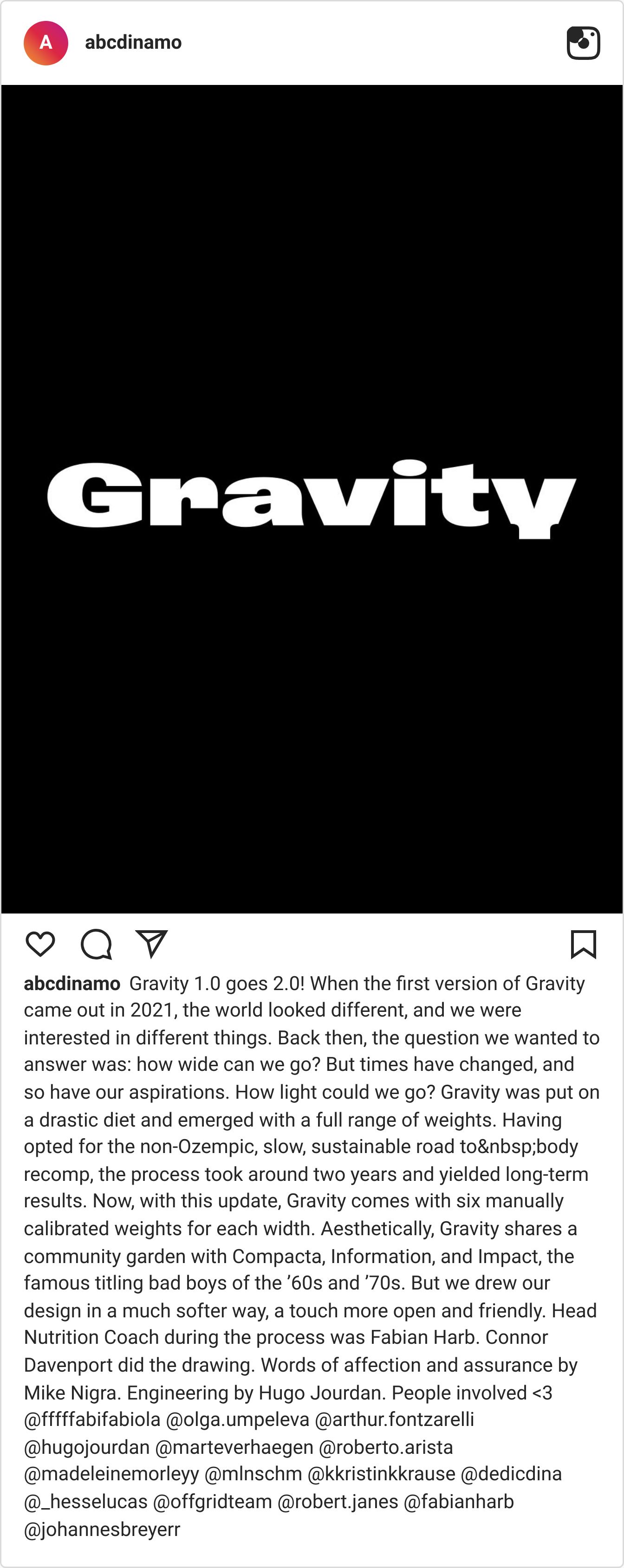
When the first version of Gravity came out in 2021, the typographic world looked different, and the primary question Dinamo wanted to answer was: how wide can we go? Times and aspirations change. Gravity 2.0 asks the opposite: how light can we go? Taking the slow, sustainable road to body recomp, Gravity was put on a drastic diet over the course of two years. It emerges now with a full range of six manually calibrated weights for each width. Aesthetically, it shares a community garden with the famous titling bad boys of the ’60s and ’70s—Compacta, Information, Impact—but it’s drawn with a much softer, more open, and undeniably friendlier touch.
Why we like it
Taking the aggressive, compressed DNA of 1960s titling fonts and making it approachable is no small feat. Gravity 2.0 manages to carry massive visual weight without feeling imposing or shouty. The manual calibration across its new lighter weights means it transitions beautifully from a pure poster-type brute into a highly functional, nuanced system.
Best for: Editorial titling · Brand campaigns needing approachability · Posters and out-of-home · Any brief asking for "impact without the aggression"
2. Zeyond Stencil (Blaze Type)
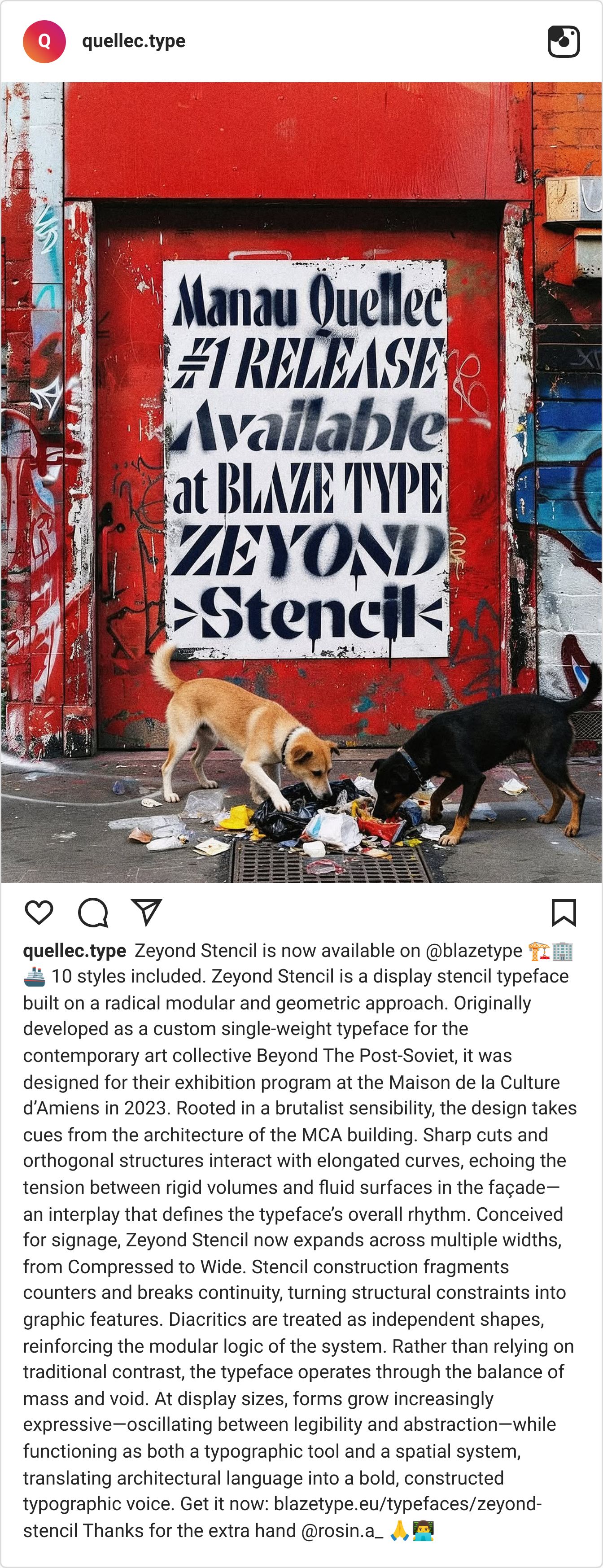
Originally developed as a custom single-weight typeface for the contemporary art collective Beyond The Post-Soviet, Zeyond Stencil is built on a radical modular and geometric approach. Rooted in brutalist sensibility, the design takes its cues from the architecture of the Maison de la Culture d’Amiens. Sharp cuts and orthogonal structures interact with elongated curves, echoing the tension between rigid volumes and fluid surfaces. Now expanded across multiple widths—from Compressed to Wide—the stencil construction fragments counters and turns structural constraints into graphic features, treating diacritics as independent, modular shapes.
Why we like it
Stencils usually fall into two traps: they either look like military crates or shipping containers. Zeyond bypasses both by operating through the balance of mass and void. At display sizes, it oscillates beautifully between legibility and abstraction. It isn't just a typeface; it’s a spatial system that translates architectural tension into a constructed typographic voice.
Best for: Exhibition identity · Wayfinding and spatial design · Brutalist editorial layouts · Architectural branding
3. Peignot Jumbo (House of Cassandre)
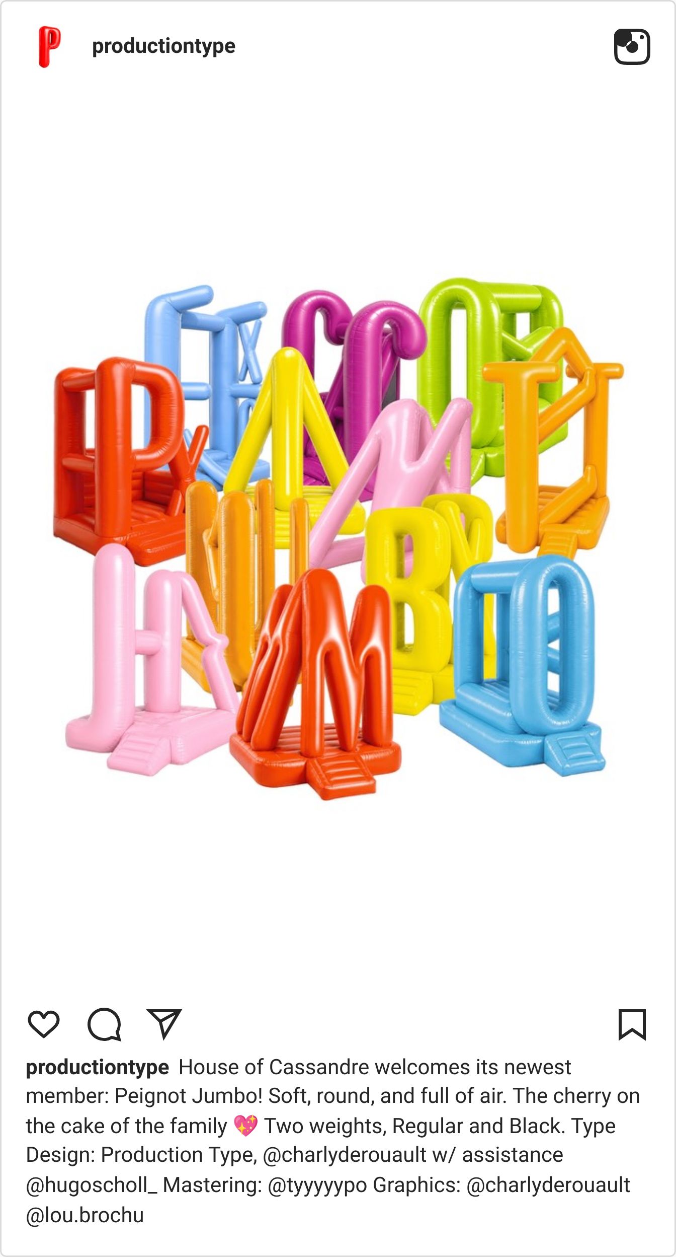
The House of Cassandre welcomes its newest member, Peignot Jumbo. The original Peignot, designed by A.M. Cassandre in the 1930s, is an untouchable Art Deco masterpiece, famous for its severe elegance and revolutionary multi-case structure that blended uppercase and lowercase forms. Peignot Jumbo takes that sacred historical geometry and pumps it full of air. It is soft, round, and remarkably tactile—trading the sharp, metallic crispness of the original for a high-volume, balloon-like warmth.
Why we like it
Messing with typographic royalty is a massive risk, but inflating Peignot is a stroke of genius. The underlying, rigid Art Deco skeleton provides the perfect scaffolding for this heavy, inflated treatment. It strips away the historical stiffness of the 1930s and replaces it with a playful, maximalist energy that feels incredibly relevant for right now, without losing its inherent structural charm.
Best for: Boutique packaging · Playful editorial covers · High-end food and beverage concepts
4. Lingo (Softdrive)
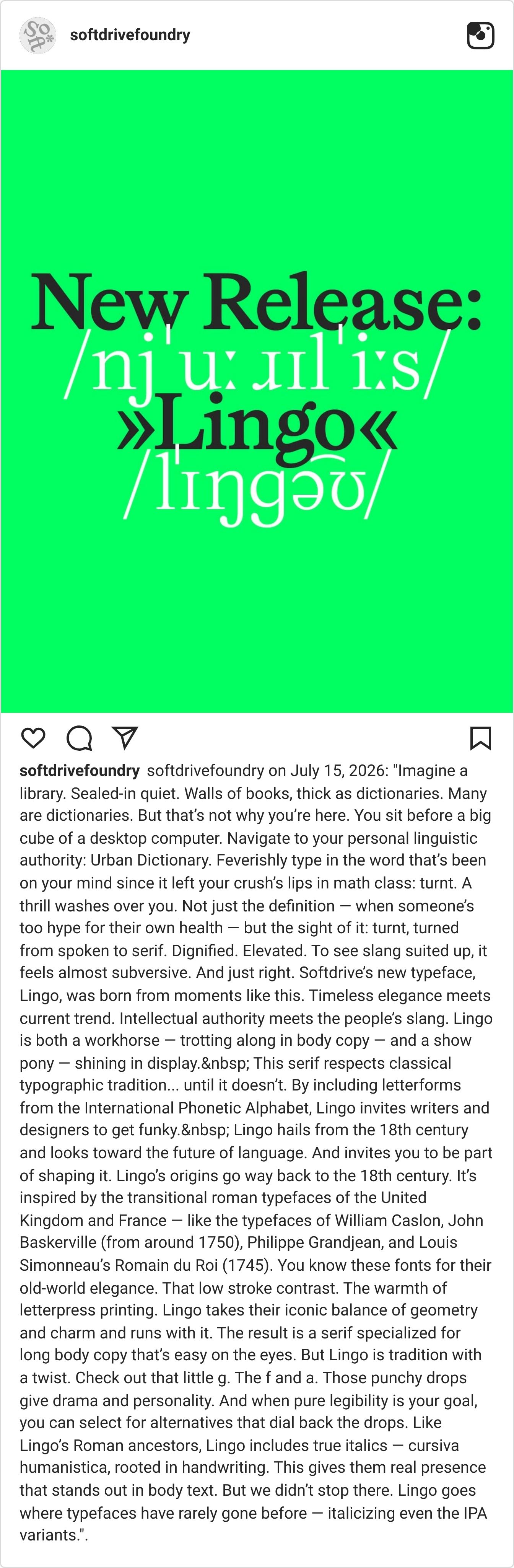
Imagine typing the word turnt into Urban Dictionary, but instead of default system text, it appears in a dignified, elevated serif. Softdrive’s new typeface, Lingo, was born from this exact friction: the moment intellectual authority meets the people’s slang. Inspired by 18th-century transitional roman typefaces like Caslon and Baskerville, Lingo takes that old-world elegance—low stroke contrast, geometric balance, letterpress warmth—and gives it a modern twist. But Lingo goes where text faces rarely go: it includes letterforms from the International Phonetic Alphabet (IPA), inviting designers to get structurally funky, and even offers true italics (cursiva humanistica) for those IPA variants.
Why we like it
Lingo works because it doesn't rely entirely on the bit. It is a genuine workhorse built for long, comfortable body copy, but it hides immense drama in its details. The punchy drops on the lowercase g, f, and a give it a specific personality, while the inclusion of the IPA forms turns it into a playground for linguistic experimentation.
Best for: Cultural publishing · Lifestyle brands · Long-form editorial · Any project balancing tradition with subversion
