

From architectural butter spires served at countryside weddings to hazard signage reconstructed in cathedral glass, this month’s findings focus on material irony, contextual disruption, and the poetry of everyday objects.
Healgoblin: Architectural Butter Sculptures (Heckfield Place)
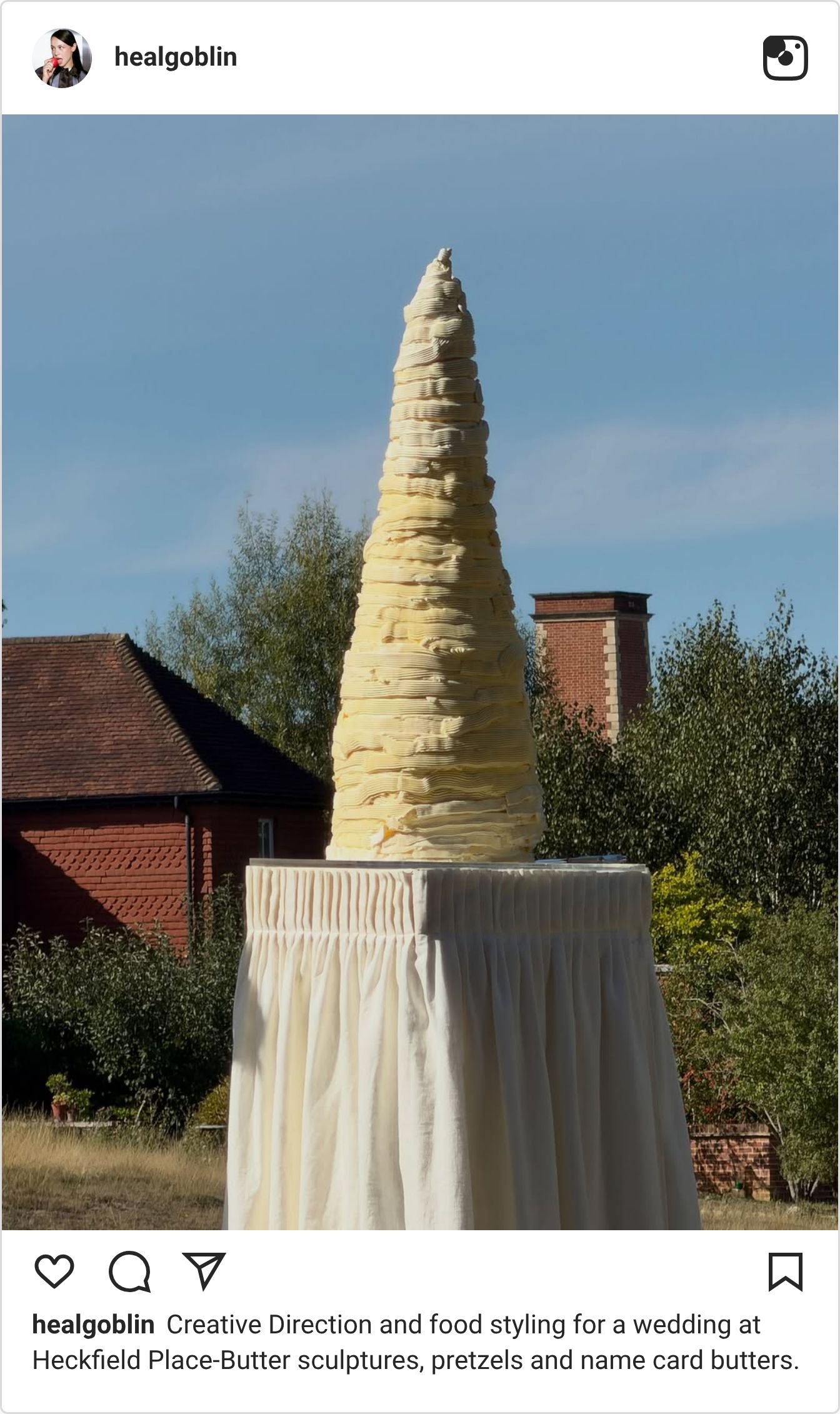
For an autumn wedding at Heckfield Place, food styling studio and creative director @healgoblin turned table butter into a commanding sculptural monolith. Carved into a tall, textured conical obelisk layered with sharp horizontal striations and placed atop a crisp pleated plinth, the installation stands in dramatic dialogue with the estate’s brick facade and rural landscape.
It is an exceptional study in material elevation. Butter—an ingredient traditionally confined to small ramekins or decorative pats—is treated with the weight and monumental scale of classical stone topiary. By colliding the organic, ephemeral melt of dairy with strict architectural geometry and high-end hospitality styling, the piece turns dining into immersive, sculptural theater.
Hayden Clay: Stained Glass Caution Sign
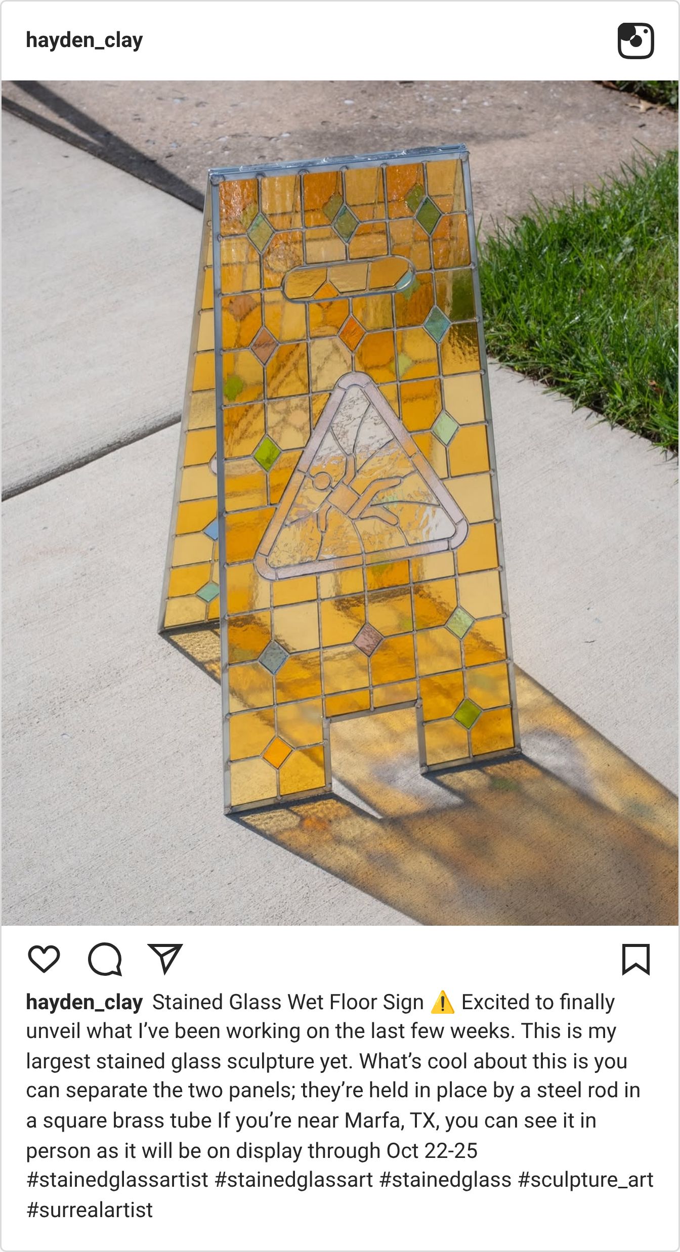
Artist @hayden_clay took one of urban life's most ubiquitous safety markers—the standard yellow plastic "Caution: Wet Floor" folding sign—and painstakingly rebuilt it as a life-sized stained glass sculpture. Constructed from dual panels joined by a steel rod inside square brass tubing, the piece features textured amber and clear panes that frame the iconic slipping-figure pictogram, casting warm, intricate refractions across the pavement.
The design works through pure material contradiction. Wet floor cones are meant to be utilitarian, high-visibility, and virtually indestructible. By translating that garish, mass-produced visual language into the delicate, sacred medium of stained glass, Clay turns commercial safety signage into an ecclesiastical art object that reframes how we look at industrial warning symbols.
Manic Botanic: Laundromat Wildflower Bloom
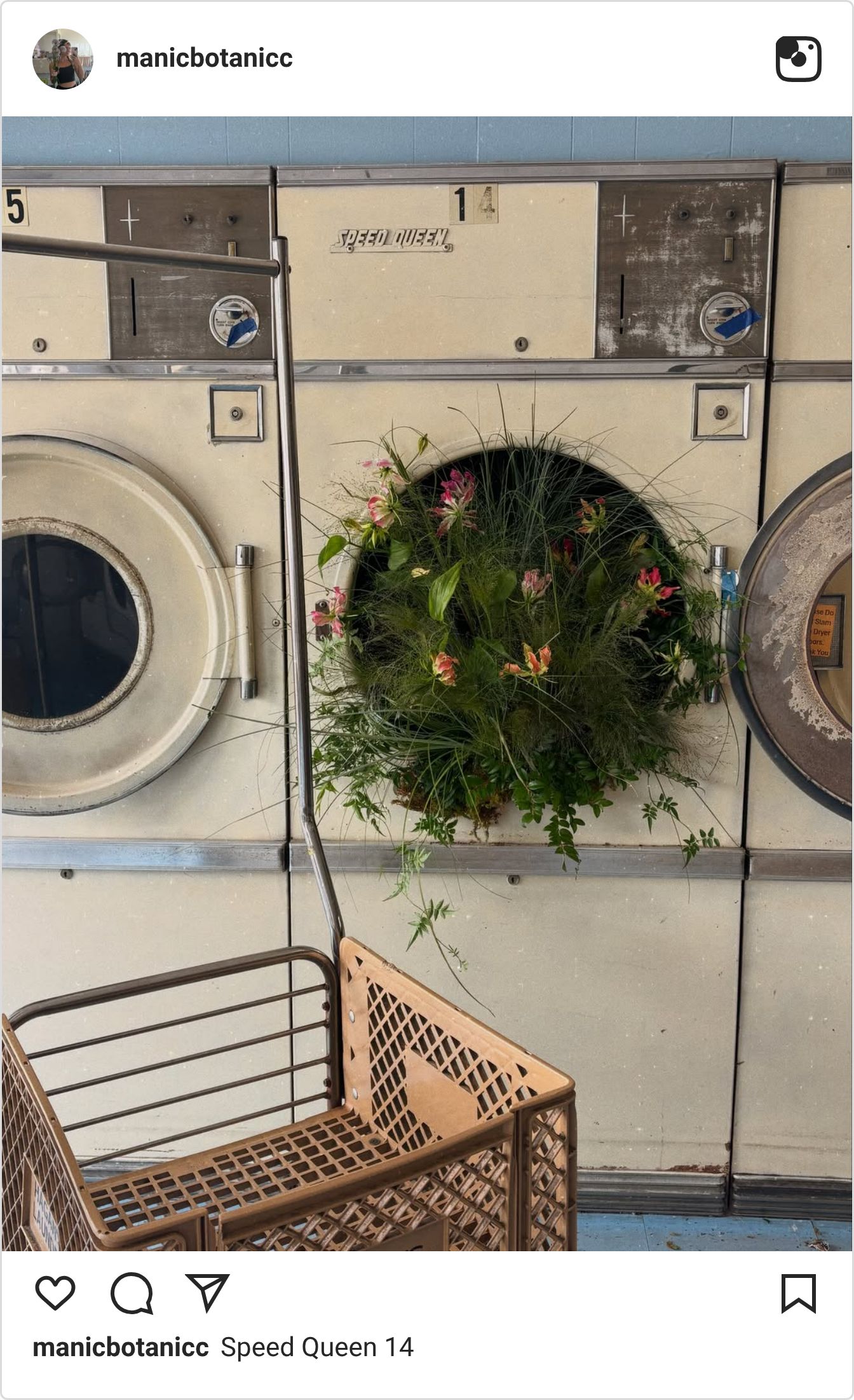
Floral artist @manicbotanicc staged a site-specific installation inside a vintage coin laundry, filling the circular drum of an aged Speed Queen commercial dryer with an untamed burst of wildflowers, slender grasses, and trailing vines. The botanical arrangement spills freely out of the open glass hatch, framed by the industrial beige enamel and metal rolling carts of the laundromat.
It is a striking example of contextual subversion. Commercial laundromats are the definition of sterile, repetitive civic routine—all chrome, motor hum, and bleached linoleum. Introducing an unruly, delicate meadow directly inside the mechanics of an industrial dryer creates an uncanny friction between artificial infrastructure and wild nature, transforming a chore space into a poetic visual pause.
Gohar World: The Surrealist Tableware
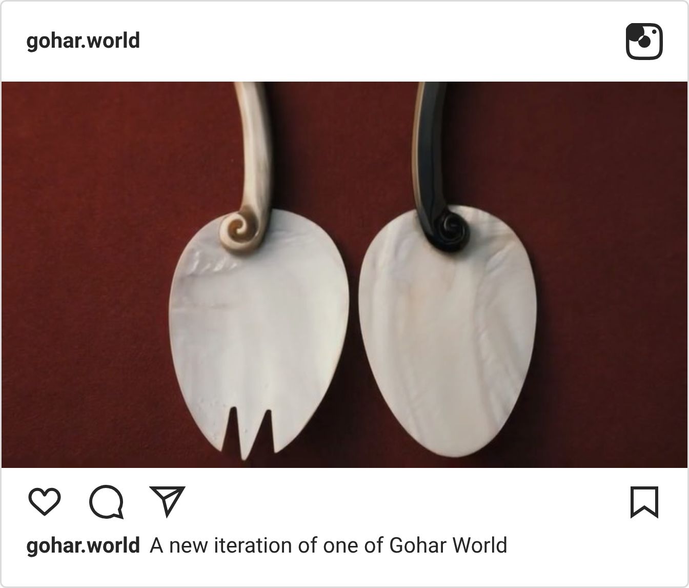
Design studio Gohar World, founded by sisters Laila and Nadia Gohar, continues to reimagine dining rituals through surreal, artisanal objects. Among their latest releases are sculptural candles cast in the exact shape and creamy yellow tint of artisan butter blocks, designed to melt into real dinner courses as functional centerpieces.
It is a masterclass in culinary trompe-l’œil and ephemeral design. By taking a kitchen staple and recontextualizing it through luxury craft, Gohar blurs the line between gastronomy, table setting, and conceptual sculpture, turning everyday hospitality into performance art.
Teenage Engineering EP-133 K.O. II: Brutalist Calculator Aesthetics
Audio design firm Teenage Engineering released the EP-133 K.O. II, a portable sampler and sequencer heavily influenced by vintage pocket calculators, 80s cash registers, and industrial control panels. It features segmented vintage LCD screens, raw plastic faders, and tactile numeric keys packaged in a stark, cardboard-wrapped unboxing experience.
In an era saturated with glossy, borderless touchscreens, this piece stands out as a celebration of pure physical feedback. It treats hardware not as an invisible interface, but as a nostalgic, hyper-tactile playground where every button press feels deliberate and satisfyingly mechanical.

Tactile Type: Knit & Fiber Letterforms
A growing wave of 3D typographers and motion designers has shifted focus toward textile letterforms sculpted out of mohair, looped bouclé yarn, and chunky knit patterns. Rather than using clean vector geometry, these digital letters simulate individual loose threads, soft gravity, and authentic fabric tension.
This trend brings much-needed sensory comfort into the digital space. It translates the cozy, tactile qualities of fall fashion directly into typographic language, reminding designers that letterforms can evoke temperature, softness, and touch through a flat screen.

For me, October was all about finding beauty in the unexpected. From butter sculptures to stained glass warning signs, this month's discoveries reminded me that great design doesn't always mean creating something new. Sometimes, it's simply about seeing something familiar in a completely different way.

