WeightWatchers' bankruptcy in May 2025 wasn't just financial—it was philosophical. The brand had spent years running from "weight loss" into vague "wellness." Then GLP-1 drugs like Ozempic proved the market never stopped wanting weight loss, just with medical legitimacy. Oprah Winfrey left the board the same year. Points systems and community meetings felt quaint when prescriptions promised faster results. The brand needed to prove it belonged in a medicalized future—or risk becoming irrelevant.
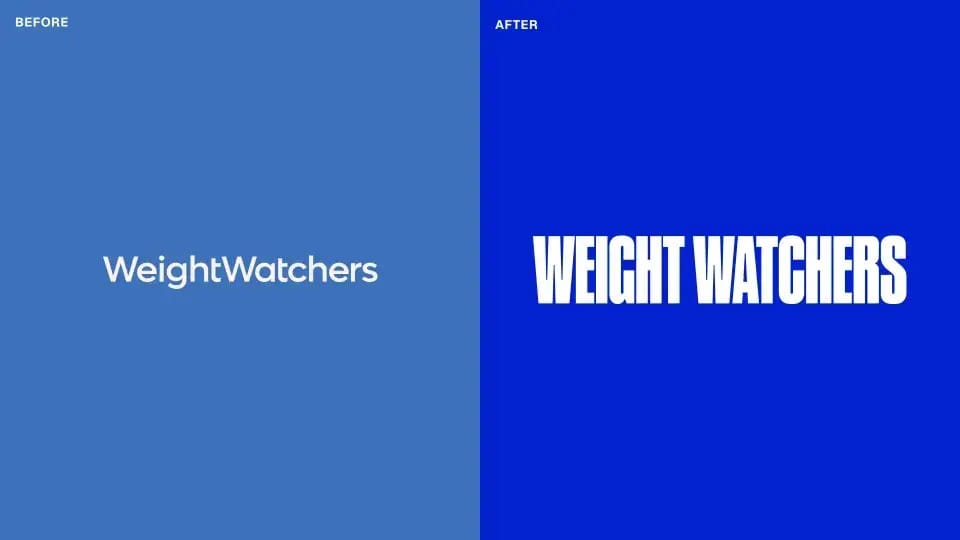
Mrs&Mr, appointed as WeightWatchers' global brand agency in September, built an identity that doesn't fight the shift to clinical care. Instead, it embraces it. The rebrand, launching December 26, 2025, replaces vague "wellness" positioning with something more valuable in a regulated category: certainty, structure, and trust.

That Progress Bar Logo
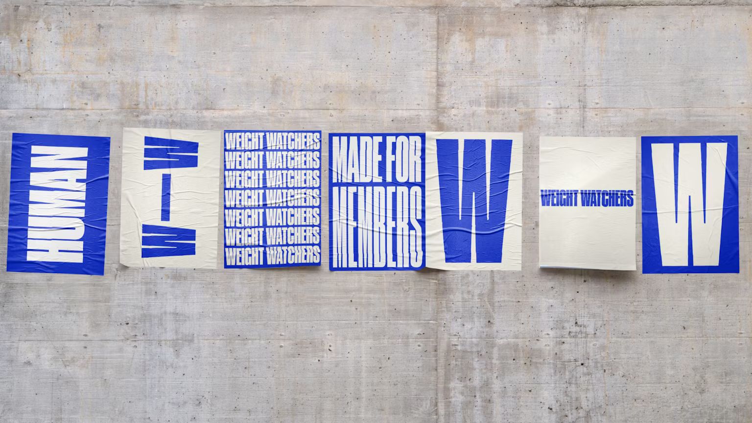
The new logomark separates two W's with a straight line—a literal progress bar. Almost too obvious. And yet it works because weight loss is exactly that: gradual, measurable, non-linear. Sometimes the most straightforward answer is the right one.
WeightWatchers also brought back its full name after years hiding behind "WW." The 2018 rebrand tried to broaden beyond weight loss into general wellness. That positioning aged poorly once GLP-1 drugs proved people still very much wanted weight loss, just with medical support. Going back to "WeightWatchers" signals the brand knows exactly what it does.
Cobalt Blue Gets Clinical
The color palette centers on cobalt blue—punchy, medical, trustworthy. WeightWatchers has always used blue, but this is a brighter, more assertive hue. It reads clinical without feeling cold—not easy when you're trying to be both a medical service and a support community.
The choice matters because color does heavy lifting in regulated categories. Muted blues signal wellness. Bright blues signal pharmaceutical. This cobalt sits right between both, which is exactly where WeightWatchers needs to be.
Typography That Does Its Job
The typography got cleaner. Members are navigating between coaching sessions, prescriptions, nutrition tracking, and community features. The type system makes it clear where you are and what you're doing. Functional over decorative.
Modern, structured letterforms separate clinical interactions from behavioral support while keeping everything approachable. This isn't going to win typography awards, and it doesn't need to. The job is clarity and hierarchy. The system delivers both.

Black-and-White Portraits Keep It Human
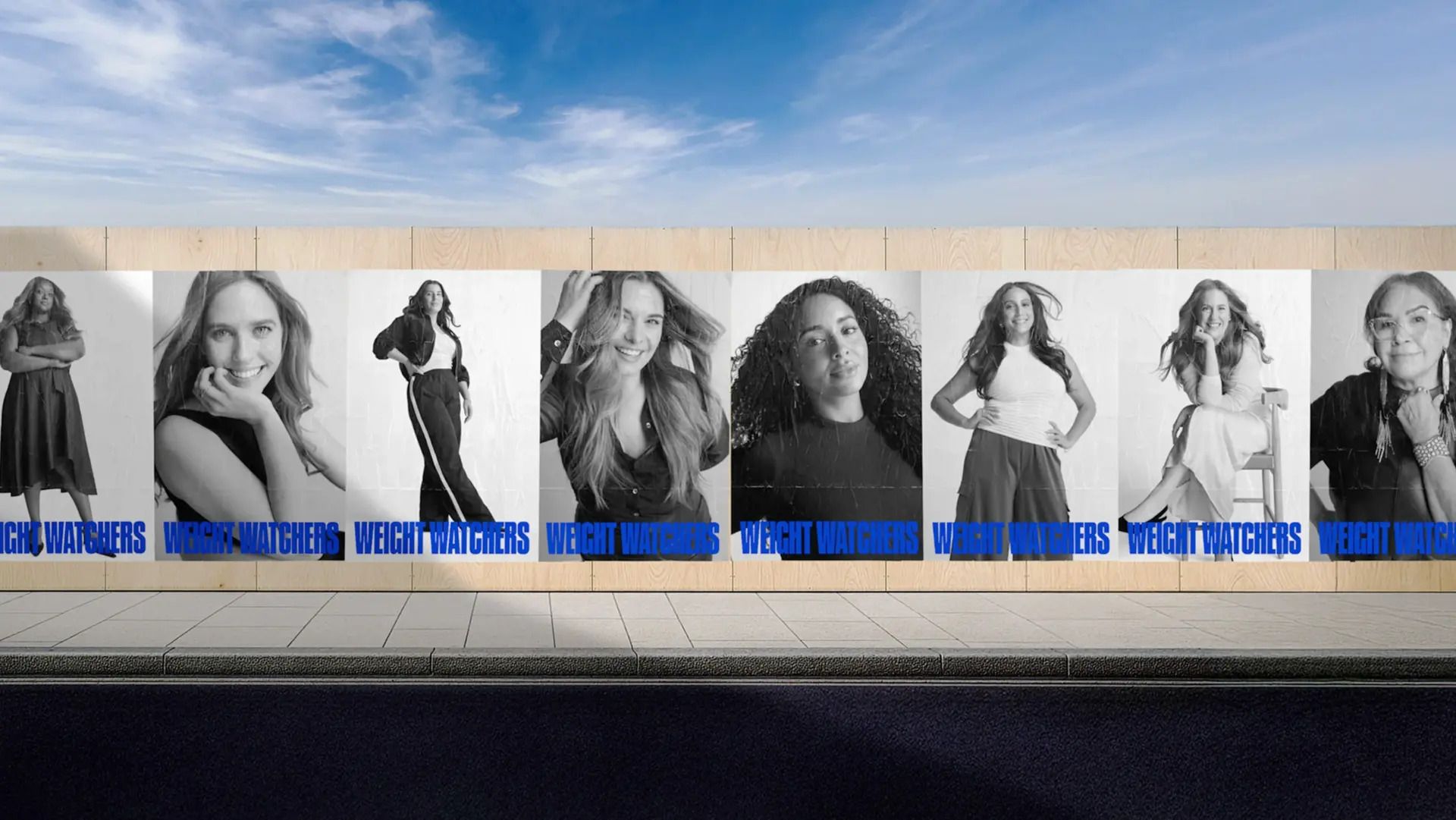
The photography direction solves the clinical-versus-human tension beautifully. Studio-shot black-and-white editorial portraits of real WeightWatchers members—shot by Australian photographer and director Cameron McNee—anchor the entire visual system.
McNee's background makes him perfect for this. He came up photographing LGBTQ+ nightclub communities, documenting chosen families and outsiders finding their tribes. His work explores identity, belonging, and authenticity. He even studied psychotherapy during the pandemic, which now informs how he approaches subjects. For WeightWatchers, that means portraits that feel confident, candid, vulnerable, powerful—not staged testimonial shots.
The portraits feature only current members. No models, no actors, no before-and-after transformations. Just people in their complexity. The black-and-white treatment strips away styling distractions. You see people, not production.
The Platform Strategy
The rebrand coincides with WeightWatchers' acquisition of telehealth provider Sequence and the launch of a fully integrated platform. Med+, their dedicated GLP-1 program, combines prescription access with nutrition guidance, coaching, and community support. The app now includes an AI body scanner and a "Weight Health Score" metric pulling data from connected devices.
The strategic bet: GLP-1 drugs work. They also have side effects, require ongoing management, and often lead to weight regain after stopping. WeightWatchers positions itself as the support system that makes GLP-1 use sustainable. Any telehealth company can write a prescription—WeightWatchers offers the behavioral scaffolding around it.
The visual system shows up everywhere—app, marketing, packaging, member communications. It has to make medical care feel connected to community support without confusing the two. Clinical accuracy lives alongside human warmth. Data-driven tools coexist with empathetic coaching.
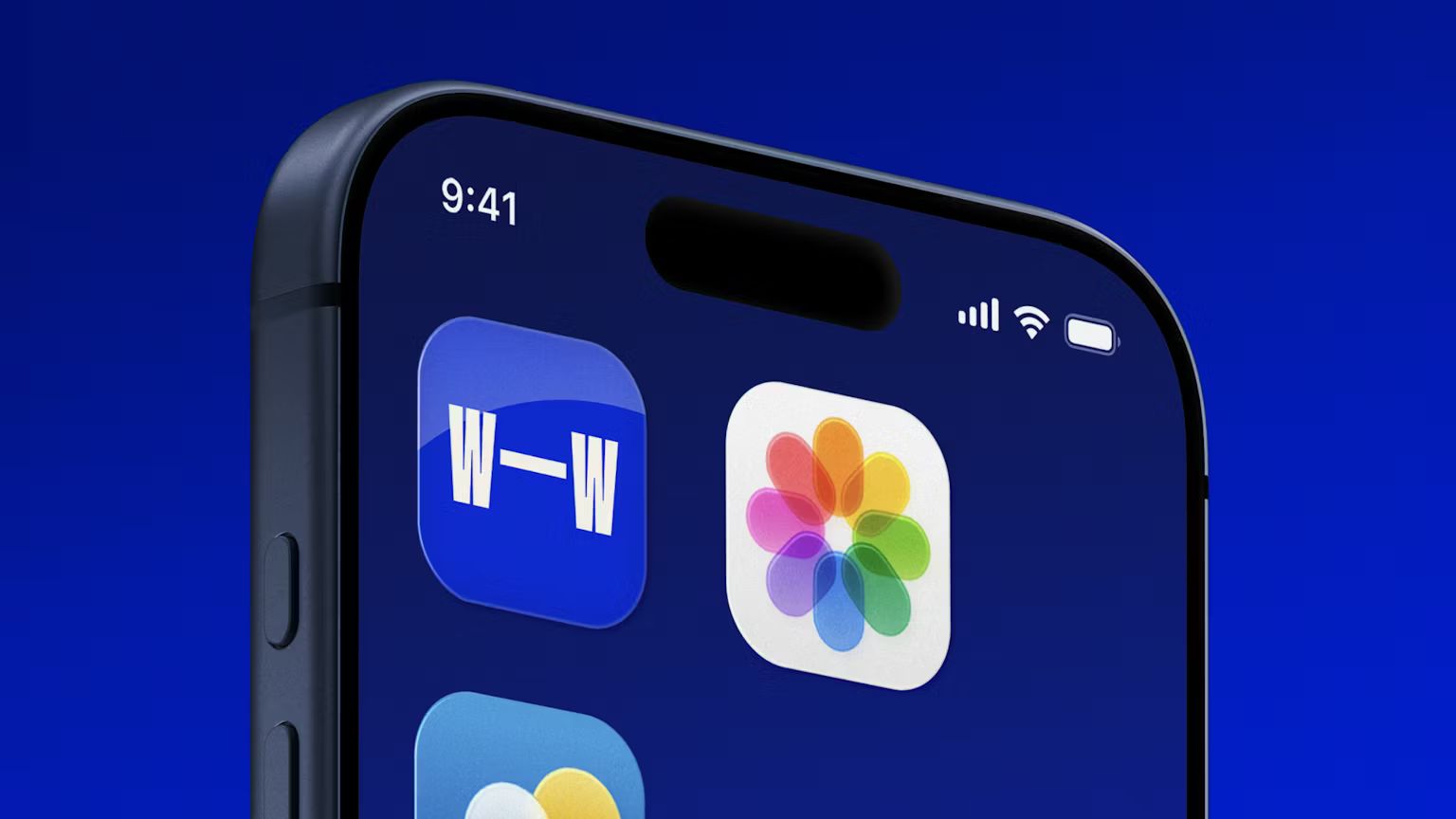
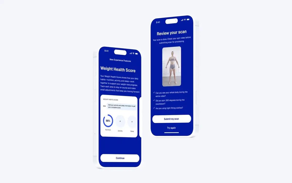
Image Credit: WeightWatchers
Where It Could Push Further
The app UI doesn't match the boldness of the visual rebrand. The redesigned experience is functional and clear, but the digital product prioritizes clarity over novelty—which is probably smart when asking people to trust you with health data. The interface feels evolutionary rather than revolutionary, and that gap is noticeable. When your brand identity signals radical reinvention, a conservative product experience creates tension.
That said, the choice likely reflects something WeightWatchers understands about medical credibility: predictability often matters more than surprise. Radical change in branding, steady reliability in product. It's a defensible strategy, even if it means the digital experience doesn't quite deliver on the promise the visual system makes.
Why This Works
Most wellness brands would've doubled down on aspiration and lifestyle imagery when faced with medical disruption. WeightWatchers went the opposite direction: lean into the medical credibility, keep the human core.
The progress bar is literal, and literal works when everyone's talking about data and outcomes. The cobalt blue signals "medical," while the warm black-and-white portraiture prevents it from feeling institutional. The typography creates structure without coldness.
The category changed. GLP-1 medications aren't going away. Mrs&Mr built a system that makes medical weight management feel structured without making people feel judged. In a moment where weight health is more clinical, more data-driven, and still deeply emotional, that balance might be exactly what a legacy brand needs to survive.

