

The first floor of LCDC Seoul used to fix cars. The concrete columns are still there, holding up high ceilings that now frame expired transit tickets displayed behind glass and postage stamps from journeys nobody can place.
The building went from auto repair shop to cultural complex in Seongsu-dong, the neighborhood everyone keeps calling the Brooklyn of Seoul. Inside: a pen pal service on the third floor trying to save handwritten letter culture, handmade soaps, a bar called Postscript on the fourth floor. Each brand is a chapter. The whole building is a story about stories.
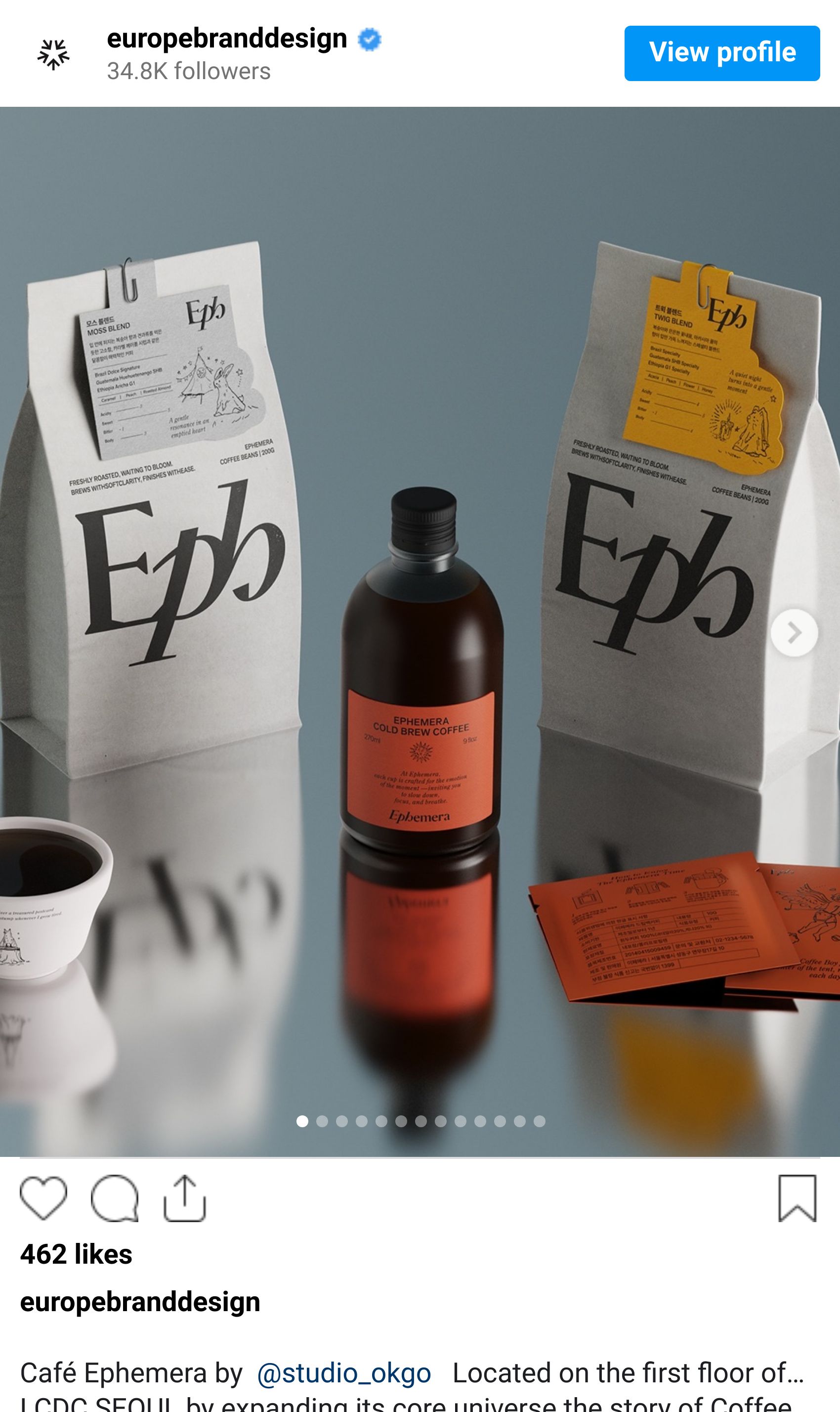
The café on the first floor is Ephemera. Studio OKGO rebranded it. The result hit Best of Behance and collected over 1,600 appreciations from the design community. Worth understanding why.

Source: Studio OKGO
Seoul has too many cafés that look exactly like this
Seoul has more cafés per capita than any other city on earth. The ones that die look fine. Clean type, warm photography, a considered palette — competently produced identities that dissolve into every other specialty coffee brand within a five-kilometer radius. The ones that survive work from a specific idea rather than a mood.
Ephemera had an idea. The name comes from a collector's term — ephemera are objects made for temporary use that outlive their function: transit tickets, receipts, event programs, things designed to be thrown away but kept by accident, becoming precious over time. The café's physical space was already committed to this concept, with expired tickets behind glass and stamps arranged like artworks, an analog vibe so deliberate it functions as a manifesto.
Most studios would have clocked the mood and responded to it. Warm illustration, period typography with good credentials, something that gestures at collectibility without committing. A good café identity.
But a concept this specific demands something different — not design that depicts the idea of collecting, but design that looks like it comes from that same world. That's a meaningfully different problem.

Source: Studio OKGO
The illustrations don't reference the concept. They look collected.
Korean café visual identity has become so codified it's practically its own category. Delicate linework. Naturalistic, muted palettes. Restrained serif choices. Beautiful and completely interchangeable — the design equivalent of music that nobody finds offensive. Walk into half the independent cafés in Seongsu-dong and you'll see variations on the same system.
The Ephemera illustration work has the formal, decorative quality of vintage transit printing — slightly ceremonial, with the rounded characters and careful ornamentation of mid-century stamp design. It's the kind of object that was produced by committee for functional use and accidentally became beautiful. Not retro in the winking, knowing way studios deploy retro, but rather something that couldn't have looked any other way because the concept demanded this specific register and nothing else.
That distinction is where most café identity work falls short. The visual system isn't illustrating the concept of collected objects — it looks like it was itself collected. One is decoration. The other is identity.
One chapter inside a longer book
Ephemera sits inside architecture that was already doing conceptual work before the rebrand arrived. LCDC's six-door third floor was designed to be deliberately inefficient — each door opens into its own enclosed world rather than a shared floor. Space wasted so each brand can't bleed into its neighbors. The building turns isolation into a feature.
That created a specific constraint. The Ephemera identity needed to feel complete and self-contained — working on a glass, a coffee sleeve, a menu, an Instagram grid — while also reading as one chapter inside a longer book. Not a standalone brand. Not a sub-brand either. Something in between that most visual systems can't manage.
The illustration language holds this tension because its internal logic extends beyond the edges of any single application. There's the sense of a world that goes further than what you're seeing — which is, not coincidentally, exactly what a storybook feels like.

Source: Studio OKGO

Source: Studio OKGO
The type doesn't apologise for where it's from
Typography in projects like this is where commitment shows. The safe choice is something warm and well-credentialed — a good serif with heritage associations that won't embarrass the concept but won't quite serve it either.
The Ephemera type has the slightly compressed, formally considered quality of things printed for function rather than fashion that ended up beautiful anyway. A railway ticket from a city the map doesn't show anymore. It doesn't read as contemporary Korean café branding. It reads as belonging specifically to Ephemera's world — which, in a building full of brands fighting for their own identity, is the only thing the typography needed to do.
Two versions of every brief
Every project has two versions of the brief. The surface one — make it look good, make it feel right, make it photograph well — and the one underneath, which is about what the brand actually means and what the design needs to do to carry that meaning. Most studios find the surface brief and deliver against it competently.
A café about the value of throwaway things that accumulate into something worth keeping needed design that felt both discarded and cherished — not design that merely depicted that idea. That distinction is why this work landed on Behance Best Of rather than disappearing into the noise. When you're on a project where the client knows the feeling but can't articulate what it means, that's not a communication problem. That's an invitation. The meaning is always there. It shows when the work inhabits the concept rather than illustrating it.
