Norwex spent three decades convincing people that microfiber cloths and water could replace chemical cleaners. It worked—well enough to build a business across 20 countries selling through 90,000 independent consultants at home parties. Then they decided to launch skincare. With packaging that looked like a direct-sales catalog and messaging that felt like activist literature, that wasn't going to fly.
London Brandging Agency The Workroom led Norwex's first full rebrand in over 30 years. What started as a packaging refresh became a complete repositioning—how to look premium enough for personal care while keeping the consultant network that built the business.

That Ambiguous Icon Does Heavy Lifting
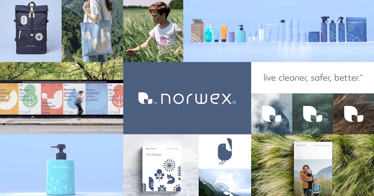
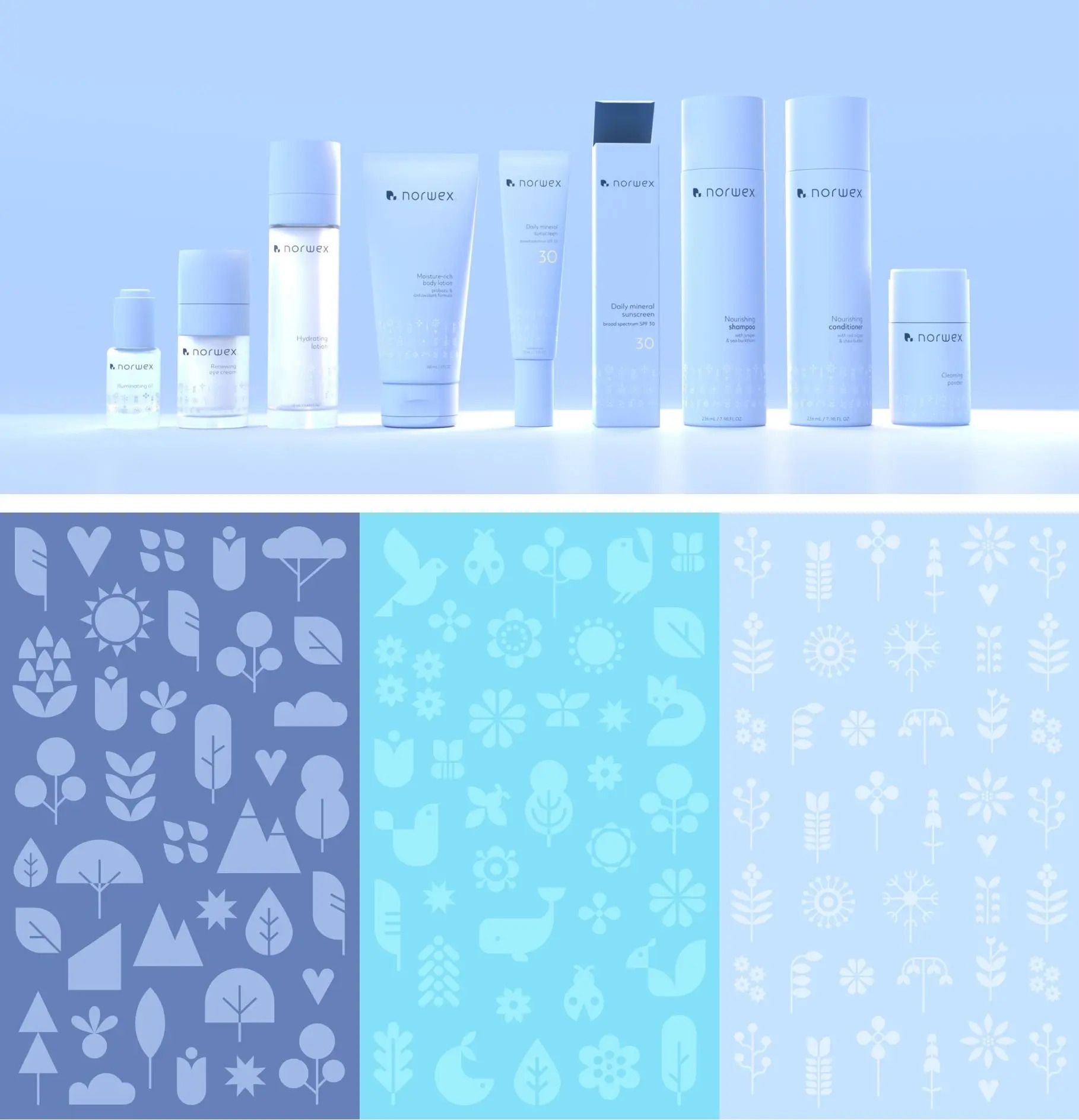
The new logo icon is intentionally slippery. Depending on how you look at it, it reads as a leaf, a bird, or a doorway. This isn't cleverness for its own sake—it's flexibility built into the foundation. The icon anchors an entire illustration system inspired by Nordic flora and fauna, giving the brand visual range across home cleaning, family care, and personal care without feeling forced.
The Workroom calls the approach "the art of just enough." Muted, nature-derived colors. Clean lines. Restrained details. The logo wordmark takes cues from organic leaf curves—subtle references to nature and growth rather than heavy-handed environmental symbolism.
Nordic design gets reduced to white walls and expensive chairs, so it's worth noting The Workroom actually researched what balance, functionality, and restraint mean in practice. The result feels considered without feeling cold.

Three Pillars Replaced 300 SKUs of Chaos
Norwex's product range had grown to over 300 SKUs with fragmented messaging across home, family, and personal care. The Workroom reorganized everything into three clear categories: Home Care, Family Care, Personal Care. Simple structure. Makes it easier for consultants to navigate the range and explain products without drowning in overlap.
This brand architecture move matters more than it sounds. When you're selling through independent consultants who need to pitch products in living rooms, clarity beats complexity. The tighter structure also supports category expansion—skincare launched six months after the rebrand, which would've been chaos under the old system.

Defining premium required actual research rather than assumptions. The Workroom ran workshops and focus groups with Norwex's customer base—largely consultants working from home, many of them mothers building businesses around families. Premium wasn't luxury. It was consistency, care, products that last.
That insight informed everything from packaging materials to tone of voice. CEO Beate Hjeltnes (founder's daughter) needed the brand to signal elevation without alienating the community that built it. The inclusive design process—workshops with consultants, stakeholders, customers—ensured the rebrand strengthened relationships rather than disrupting them.
Brigid McMullen, Workroom's founder: "Norwex already had a rock-solid belief system. Our job was to help express it more concisely, distinctively and memorably—not only in words, but in how it would be experienced and felt across every product and platform."
The Mission Statement Got Less Angry
Norwex's original mission—"radically reducing chemicals"—was confrontational and effective. Also polarizing. The updated version softens: "sharing a cleaner, safer way of living by reducing harmful chemicals in everyday lives." New tagline: "Live cleaner, safer, better."
Less activist manifesto, more accessible lifestyle positioning. The shift matters when you're trying to stretch beyond cleaning into skincare and personal care. You can't sound like you're picketing outside Target when you're asking people to put your product on their face.

Results Came Fast
Within six months of launch, Norwex introduced its first skincare range—a move that would've been impossible without the rebrand foundation. Social media impressions jumped 50%, comments increased 29%, website time went from 25 seconds to nearly 4 minutes. Consultants reported renewed confidence presenting the brand.
For a company banning 2,500+ substances from products while operating in direct-selling (a category that carries MLM baggage whether deserved or not), the rebrand demonstrates how heritage businesses evolve without losing credibility.
The timing mattered. Clean beauty is saturated with venture-backed startups and slick Instagram branding. Norwex needed to signal it belonged in those conversations while maintaining the grassroots consultant network that actually moves product. The Workroom threaded that needle—delivered an identity that feels contemporary and elevated without looking like it forgot where it came from.
Heritage businesses don't need revolution. They need translation. Norwex had 30 years of product credibility and values-driven positioning. The identity finally caught up to the ambition.

