

Open any AI consultancy's website and you already know what you're getting. Dark background, blue gradient. Abstract neural network doing its thing in 3D. Some version of Inter, or close enough. "Transform." "Accelerate." "Unlock." Photography of diverse professionals pointing at screens that show dashboards nobody actually uses.
The visual language of enterprise AI has converged so completely that you could swap logos between competitors and nobody would notice for a week.
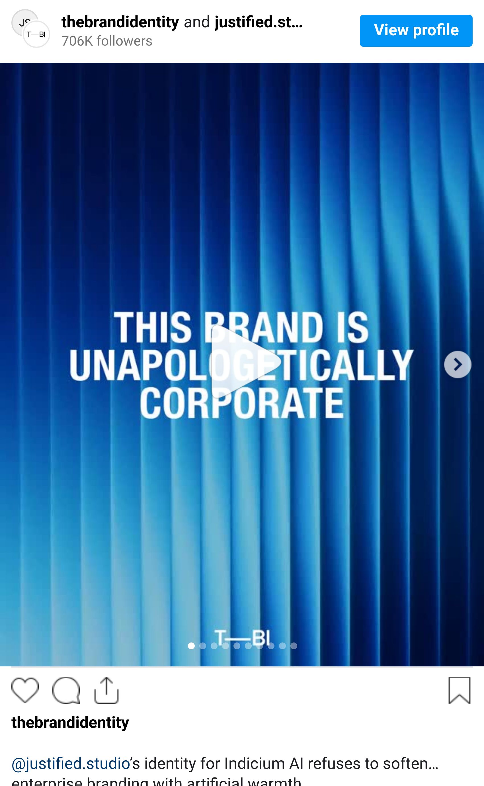
Indicium AI is the merger of Indicium and Mesh-AI — one Brazilian, one British — now a single data and AI consultancy with PepsiCo, National Grid, and Roche on the client list. 600+ specialists across the Americas, Europe, and LATAM. London studio Justified Studio built the identity.
The bit everyone gets wrong
The reflex in corporate identity is to soften everything. Add friendly illustration to signal approachability. Round the corners. Use warm tones so the board doesn't flinch. The working assumption: looking corporate is a problem that needs fixing.
Dan Woodward, Senior Creative at Justified, describes what they rejected: treating corporate positioning as a constraint that needs softening. His argument — and it's a good one — is that for a consultancy selling trust to C-suites and technical architects simultaneously, that apologetic instinct backfires. It dilutes credibility rather than broadening appeal.
So they went the other way. They started with authority. Then pushed to see how far they could take it before it cracked.
Fractal Glass
Indicium AI sits between raw, messy data and the humans who need to make decisions from it. Glass became the working metaphor: not something that distorts, but something that refracts and focuses. What comes through is clearer than what went in.
Justified built the system in WebGL. A fluid simulation forms the base layer, with physically accurate glass behavior on top. Real-world photography sits underneath — invisible to the viewer, but shaping the refraction and texture of everything above it. The effect never repeats. It shifts and responds, doing real brand work: a system that moves like something alive, not something rendered once and forgotten.
Woodward calls it "a bespoke fractal distortion that behaves more like a living system than a static visual." Watch it on the website and you'll see the description holds up. This isn't decorative motion. The movement is the point.
What Justified built wasn't a hero image with a glass effect draped over it. It's a toolkit — animatable, embeddable natively on the website, capable of generating infinite variation without losing coherence. Every execution looks different. None of them look like anyone else.

Inter Was the Right Call
Inter as the primary typeface will make some designers wince. The obvious choice. The safe reach.
But Indicium AI is a merger — two organizations, multiple markets, hundreds of employees, one brand rolling out simultaneously across all of them. Removing friction is the design move. Woodward's reasoning: Inter is open source, universally accessible, zero licensing friction. Every employee uses it from day one without a procurement conversation getting in the way. The typeface becomes infrastructure, which frees everything else to do the work.
The expressive weight sits entirely in the Fractal Glass system. Which means the typeface's only job is hierarchy and clarity, and Inter delivers both without demanding attention. CoType Foundry's Aeonik Fono handles the support role — monospaced in feel without the line-length problems of going full monospace. It reads technical and stays functional. The system carries the personality. The type just holds everything in place.
Two Audiences, One System
Indicium AI's CMO David Gadd describes the brief plainly: two audiences who don't want the same thing. Technical leaders — architects and engineers who've been pitched by every enterprise AI vendor going — need credibility. C-suite decision-makers need confidence that complexity becomes measurable outcomes.
Most enterprise identities pick one register. The Fractal Glass system holds both. It's precise and engineered enough to read as credible to people who know what good technical work looks like. Expressive enough to be memorable in a boardroom. Gadd frames it as "precise and engineered without being opaque" — which is a cleaner brief than most studios ever receive from a client.
Why This Matters
Enterprise identity is consistently the most under-designed category in branding. The brief usually arrives pre-hedged: credible, authoritative, trustworthy — code for don't take any risks. Studios comply. Clients get something that looks like every other company in their space. Everyone moves on.
Justified Studio designed against category assumptions rather than within them. The Fractal Glass system is technically ambitious, globally deployable, and more visually interesting than most consumer brand work from this year. They didn't ignore the category's constraints—they took them seriously enough to design against them.
When a brief says "we need to look credible," that's a design problem worth solving. Not a ceiling.
