

Type of Feeling keep putting out fonts that just work. There's something consistent about how they operate — they understand that personality and function aren't in tension, that a typeface can have a genuine point of view and still hold up across a full identity system. Not many foundries get both right. Gravitas is their latest, and it belongs on your radar.
Alongside it this month: Palma from Pangram Pangram, Playtype's AAA Collection, and Apoc from Blaze Type — which has been quietly expanding since 2018 and just became a lot more useful.
1. Gravitas (Type of Feeling)
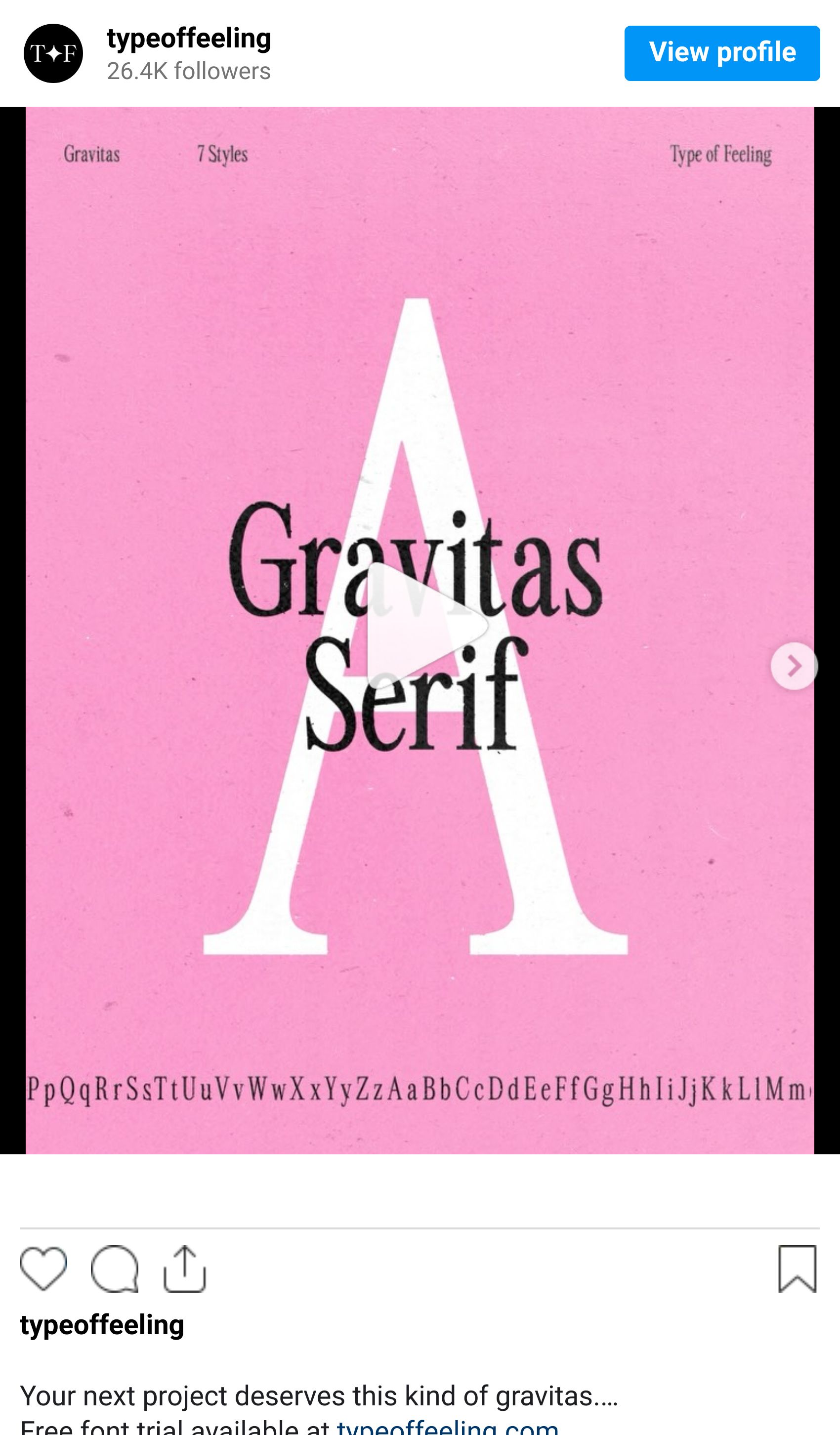
Type of Feeling is worth knowing. The kind of foundry that earns its name — every release has a perspective on it, not just a construction method. Gravitas draws its name from the Latin: weight, dignity, substance. It's a condensed serif built around the idea that authority comes from structure, not volume. Minimal stroke contrast. Condensed proportions that give running text a forward momentum without pushing into tension. It was designed, explicitly, for communicating with self-assurance — the kind that doesn't need to announce itself.
Why we like it
Most condensed serifs tip into either editorial aggression or historical nostalgia. Gravitas sits in a quieter register than both. The condensed proportions mean it pulls in a lot of information fast without feeling compressed — efficient in a way that's genuinely difficult to achieve in this category. For any brand brief where the word "authority" appears without a qualifier, this is worth the conversation before you reach for your usual go-to.
Best for: Financial identity · Legal and institutional · Packaging requiring weight and restraint · Any brief where the client used the word "commanding"
2. Palma (Pangram Pangram Foundry)
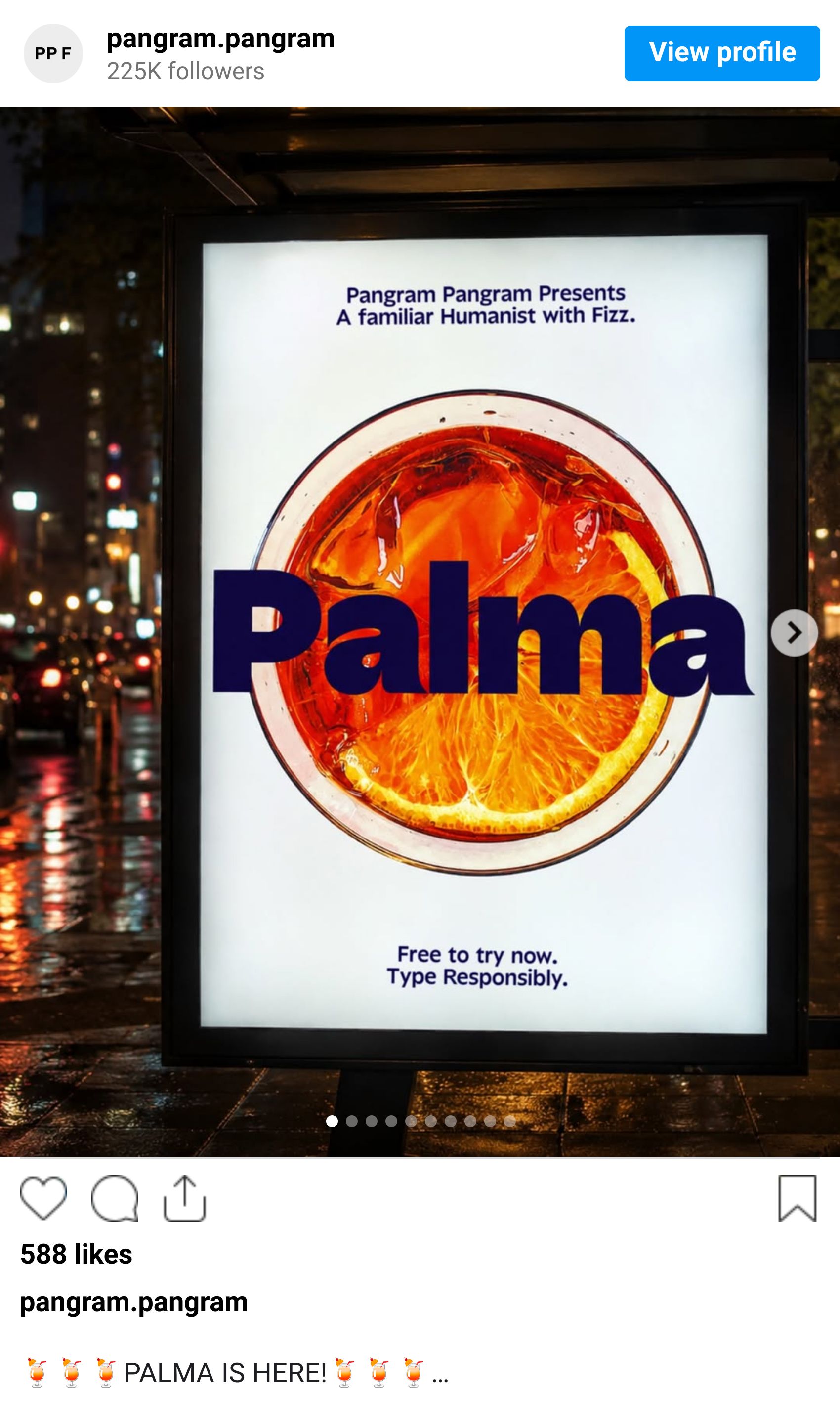
Pangram Pangram has a specific skill: building type systems that look like they were designed for one thing but turn out to be useful for everything. Frama did it for geometric sans. Palma does it for the humanist-to-expressive spectrum.
Palma looks back at Antique Olive, Johnston, and Avenir — and then treats those references as a starting point rather than a destination. The result is a family that runs in two directions from the same root. One half is a toned-down humanist sans: open forms, natural proportions, built for comfort at text sizes. The other half — the "Fizzy" subfamily — runs in the opposite direction. Tighter geometry, crisper details, spacing calibrated for large-scale applications where you want the type to do some work. Same 28-style family, two completely different registers.
Why we like it
The practical argument is simple: one license, two tones. For studios running brand systems where the headline register and the body register need to feel related but distinct, Palma does that internally — no pairing required. The variable format makes it more useful still. For Art Directors who are tired of explaining to clients why they're licensing two fonts, this is the answer.
Best for: Brand systems needing tonal range · Consumer tech · DTC brands · Any project where the brief contains the word "versatile"
3. The AAA Collection (Playtype Foundry)
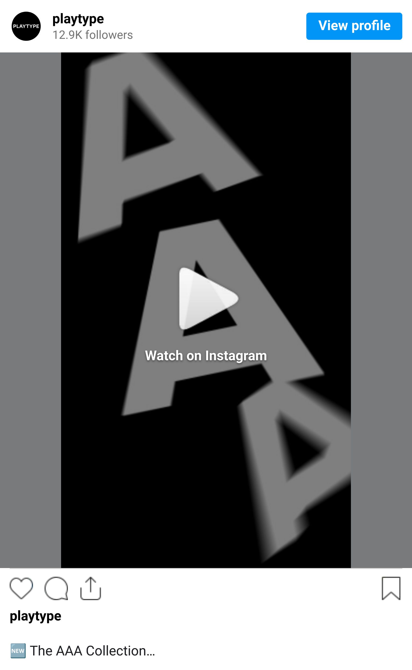
Playtype is a Copenhagen foundry with a clear point of view: historical type DNA, pushed into contemporary applications. The AAA Collection is their most direct statement of that.
AAA is a modern interpretation of chamfered letterforms from 19th-century American wood type — specifically the angled-corner style that first appeared in 1830s Gothic and Egyptian specimens. If the forms look familiar, they should. This is the exact typographic DNA on vintage college football varsity jackets, on mid-century packaging, on any logotype from that particular era of American commercial printing where display type had to hold up at six feet.
The system gives you three widths (Condensed, Normal, Expanded) across nine weights. The Display versions run super-tight tracking specifically for large-scale headlines — the kind of setting where most typefaces fall apart. Stylistic alternates throughout, which matters when you're building something that needs to hold up across formats.
Why we like it
Nostalgia without pastiche is hard to pull off. AAA manages it because Playtype built for contemporary scale rather than period authenticity — the reference points are clear, but the system is built for right now. For brand identity work where the brief involves "heritage" or "Americana" without immediately reaching for clichés, this is the most controlled tool available in that space.
Best for: Sports and lifestyle brands · Heritage identity · American-market packaging · Logotype systems needing scale versatility
4. Apoc Family (Blaze Type)
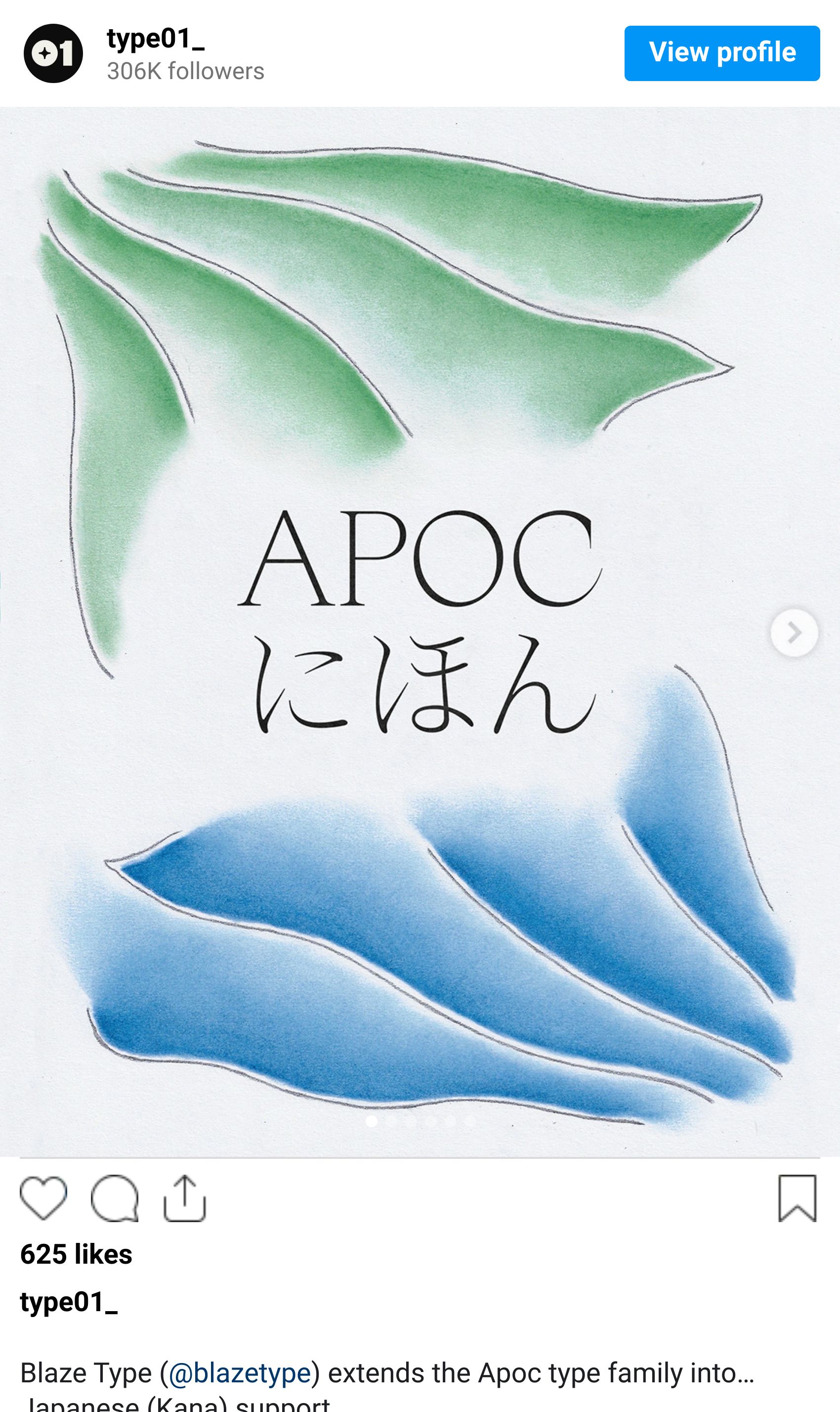
Blaze Type has been building Apoc since 2018. At this point it's less a typeface than an ongoing argument — one of the more interesting ones in contemporary type design.
The story
Apoc embodies the battle between Light and Dark. Originally released in 2018 by Matthieu Salvaggio, it has evolved into one of the most expansive systems in independent type — thin weights that are genuinely delicate, heavy weights that are genuinely sharp. The latest addition is Apoc JP, adding Japanese Kana support for both horizontal and vertical writing systems. The Latin system was already a serious editorial tool. The Kana extension makes it a global one.
Why we like it
Widely considered the most popular typeface in contemporary independent design, and the latest updates only add to the case. Apoc isn't trying to blend in, and that's the right call for what it is. It works best when the project has an opinion too — editorial, cultural institutions, contemporary art, anywhere the brief says "considered" rather than "accessible."
Best for: Editorial and publishing · Art and cultural institutions · Contemporary fashion · Any project where the typography is part of the argument, not the background
