

When the internet gets unbearably loud, we start looking for a pulse. We look for comfort in fellow designers and makers who still give a damn about the craft and share the same stubborn values we do. To kick off our Nice Things series, we dug through our agency folders to pull the work that made us smile, made our hearts race, made us suddenly crave pizza, and reminded us why we even like doing this for a living.
We spend our days pushing flat pixels around a glowing glass rectangle. But looking at the links we obsessively saved this February, a clear pattern emerged: we are desperately craving things with physical gravity. Things you can actually drop on the floor and hear a thud.
Here is what made the list this month:
1. Studio OTTO’s "No Logo" Process

Studio OTTO in the UK handled the album campaign for Olivia Dean. The crazy part? They actively avoid starting with a logo. They built a physical tour bus. They designed the tactile vinyl sleeve. They created a stage set. The identity just naturally bled out of those physical containers.
It’s a great reminder to stop drawing vectors in a vacuum. Build the room first, then decide what the wallpaper looks like. When a client demands a scalable app icon on day one of a project, I show them this workflow. It buys us time to figure out the actual physical world the brand lives in first.
2. Lacoste’s Paris Café
Lacoste just opened a café on Avenue Franklin D. Roosevelt. Deep greens, terracotta tiles, heavy wooden chairs. They serve drinks made of matcha and coconut water. It’s a masterclass in translating an apparel brand into hospitality without just printing a green crocodile on a paper cup.
If you’re ever trying to convince a startup that a branded tote bag isn’t a brand extension, show them this. The environment is the product. But don't try to fake it—if you execute this level of spatial branding on a cheap pop-up budget, it just looks like a sad trade show booth.
3. The LEGO x Crocs "Brick Clog"
A massive, green foam shoe that looks exactly like a 2x4 LEGO brick. $150. It is completely absurd, and I saved it the second it hit my feed.
I don't want to wear it, but it proves that if you push a concept entirely into the realm of the ridiculous, people will line up for it. The confidence of that blocky silhouette is the perfect reference point when someone tells you a packaging concept is "too weird." It only works because both brands share a DNA of injection-molded plastic. If a serious financial brand tried a stunt this weird, it would instantly ruin them.
@hypebae @Crocs x @LEGO really said "I'm 2 blocks away" with their debut collab 🧱 We just stepped out to see the public's opinion of the shoe first... See more
4. Rebecca Manson’s Ceramic "Smushes"

Manson builds massive butterfly wing sculptures out of thousands of tiny porcelain fragments she literally calls "smushes." Up close, it’s pure chaos. Dust, varied textures, overlapping shadows. Step back, and it forms a perfect, delicate wing.
Rendered 3D perfection looks cheap to consumers right now. Deliberate, messy macro-texture looks expensive. It physically hurts my brain to think about how long it took her to assemble these.
5. The Alma Charger

It’s a wire-free, hands-free charging block that looks like a heavy piece of crafted home decor. Brushed metals, solid stone bases. It completely ignores the glossy black plastic aesthetic of standard tech accessories.
Sometimes the best way to brand technology is to completely hide it. Just don't hide the utility so much that the user can't find the charging indicator light.
6. Future Fur by Atollon

Future Fur makes ultra-soft blankets out of recycled plastic bottles. The agency Atollon handled the branding, and they explicitly banned every sustainability cliché in the book. No earthy browns. No muted greens. No sad little leaf motifs. Instead: stark bright red, Kelly green, sky blue, and massive, confident typography.
7. Pizza Hut’s Vertical Pizza Box

Agency Iris just dropped a mysterious "vertical pizza box" onto the streets of London. No press release. No explanation. They just let random people walk around the city carrying a tall, upright cardboard box with the Pizza Hut logo on it. It immediately sparked a massive online debate about the physics of carrying a hot pizza vertically without ruining it.
Absolute chaos marketing. They broke the one sacred, unspoken rule of pizza (keep it flat) just to make people mad on the internet. Sometimes the most powerful thing you can do is make something structurally baffling and refuse to explain yourself.
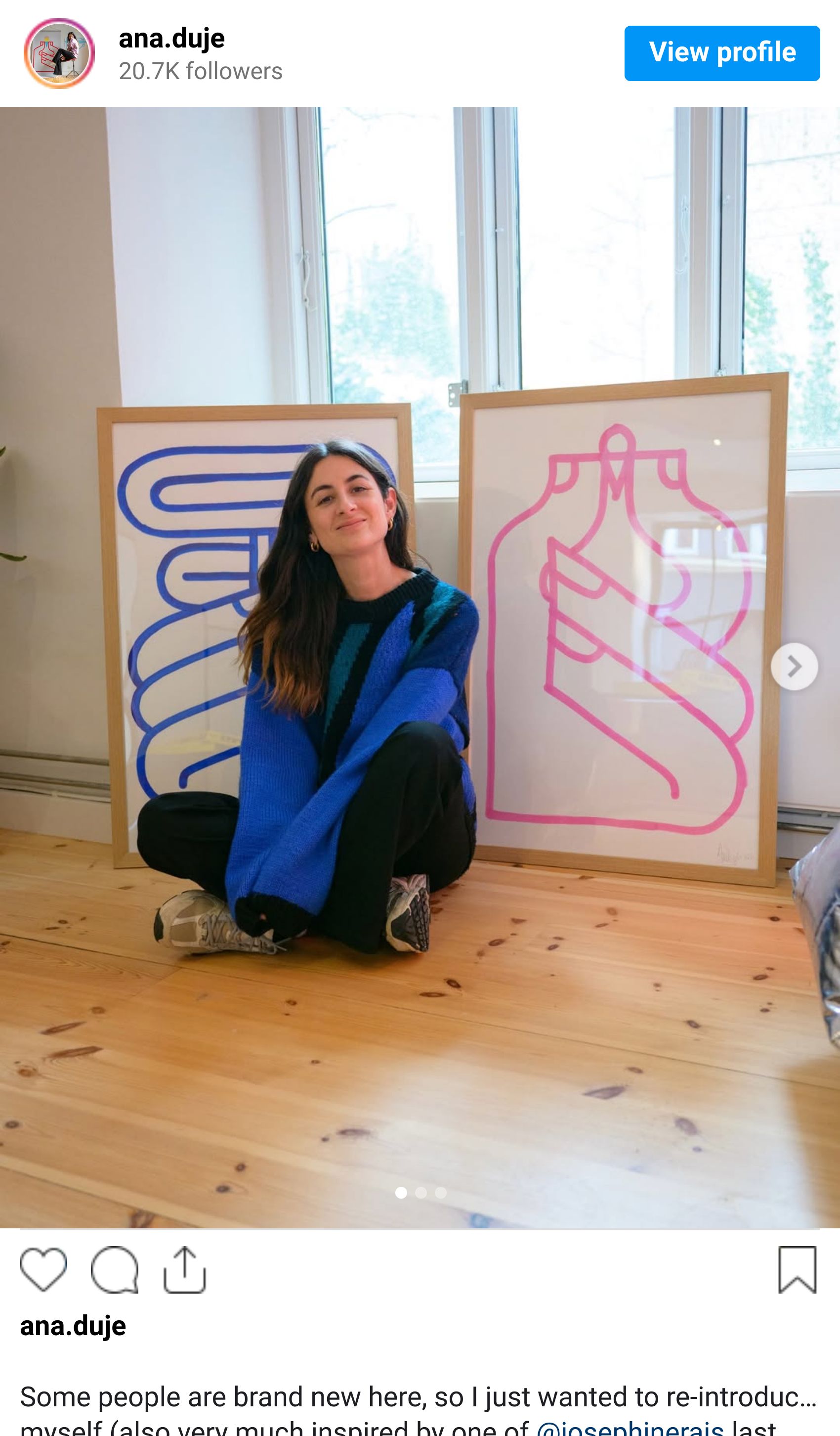
8. Ana Duje’s Physical Store, "Flan"
Illustrator Ana Duje just opened an actual, physical shop called Flan. She is known for incredibly vibrant, bold, flat vector illustrations, and now she's translating that entirely digital aesthetic into a physical retail space filled with tangible goods.
Why I’m obsessed: It’s the ultimate pivot dream for anyone pushing pixels all day. You make flat JPEGs for years, and then you just snap and build a physical room named after a wobbly dessert to sell real objects you can hold. It bridges the gap between digital precision and physical joy perfectly.
Why We Even Save This Stuff
I probably won’t get to pitch a vertical pizza box to my fintech clients this week. I definitely won't get the budget to open a retail store named after a pudding just for fun.
But that’s not really the point. We spend forty hours a week sliding our fingers across flat glass, making fake digital boxes align perfectly on an invisible grid. Of course we want to stare at giant foam LEGO shoes, heavy stone blocks, and weird ceramic wings. It’s visual proof that the real world is still messy, heavy, and physically inconvenient.
We'll keep bookmarking the things we actually want to reach out and touch, dig through our server, and drop the best ones right here next month.
